DOUG OHLSON
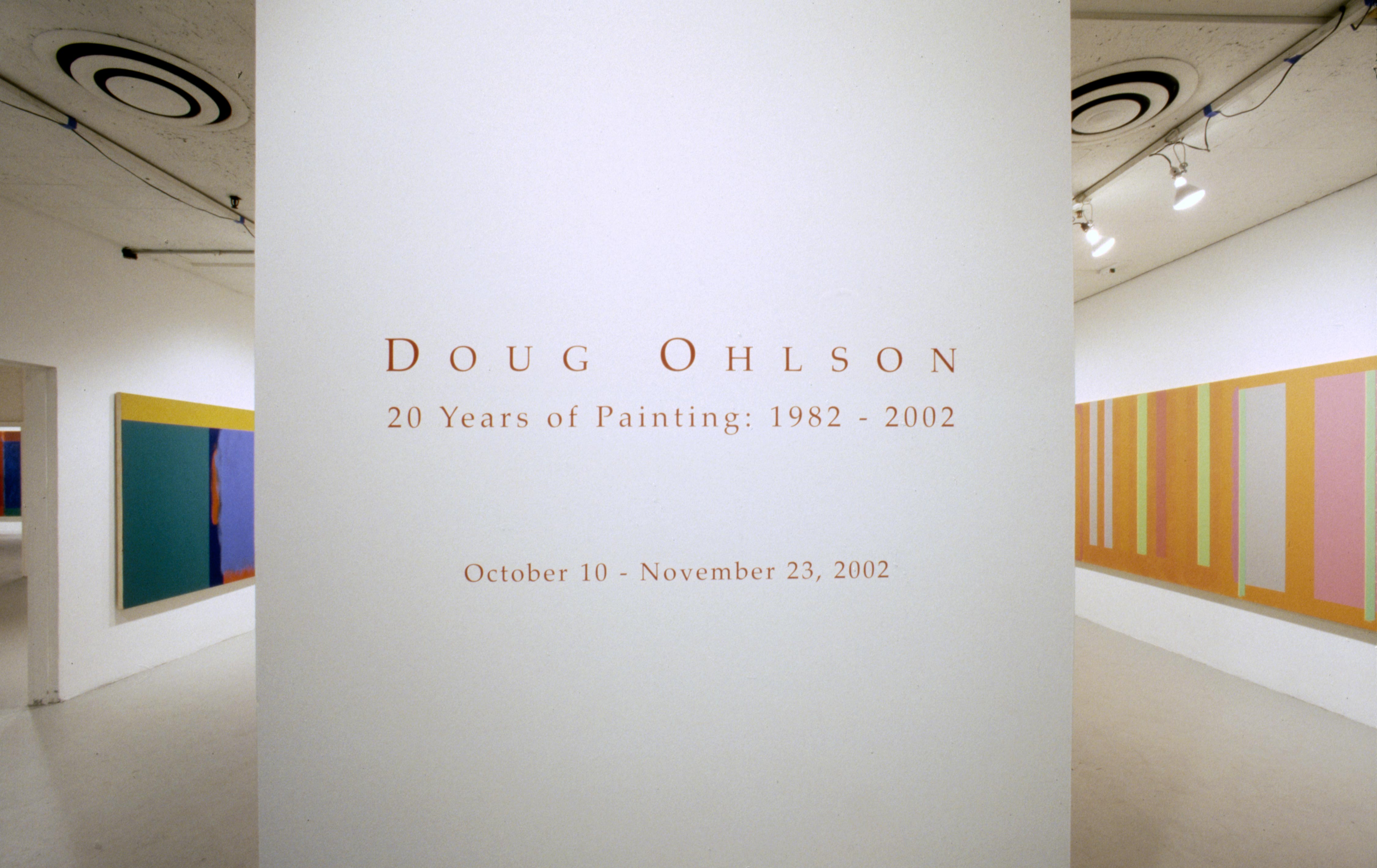
Doug Ohlson 20 Years of Painting 1982 - 2002
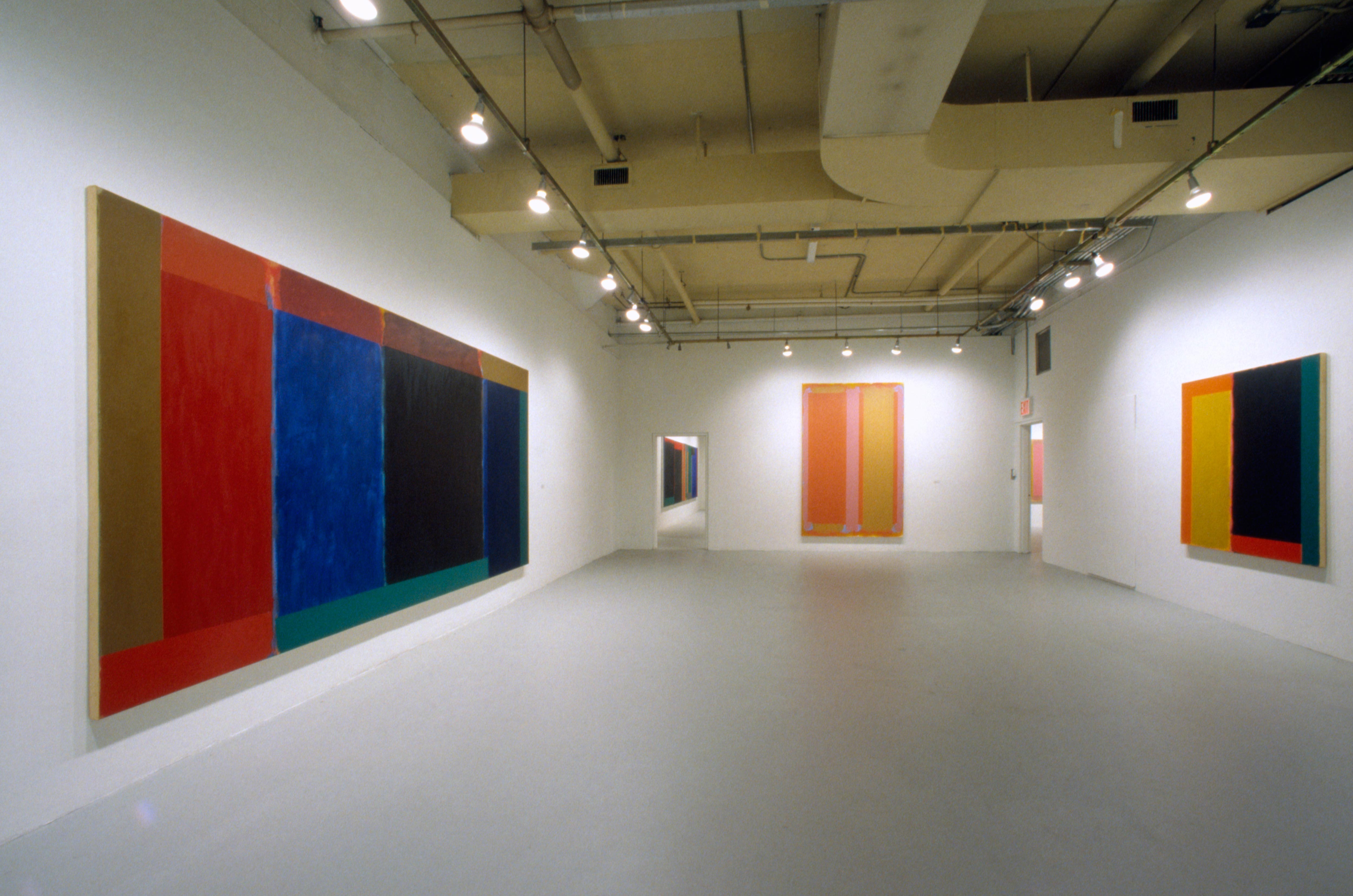
Hunter College / Times Square Gallery
October 10, 2002 - November 23, 2002
Hunter College / Times Square Gallery.
Curated by Richard Stapleford, Professor of Art History
Doug Ohlson 20 Years of Painting 1982 - 2002
Hunter College / Times Square Gallery


Doug Ohlson’s Fields of Meaning, Art in America March 2003
BY CARTER RATCLIFF
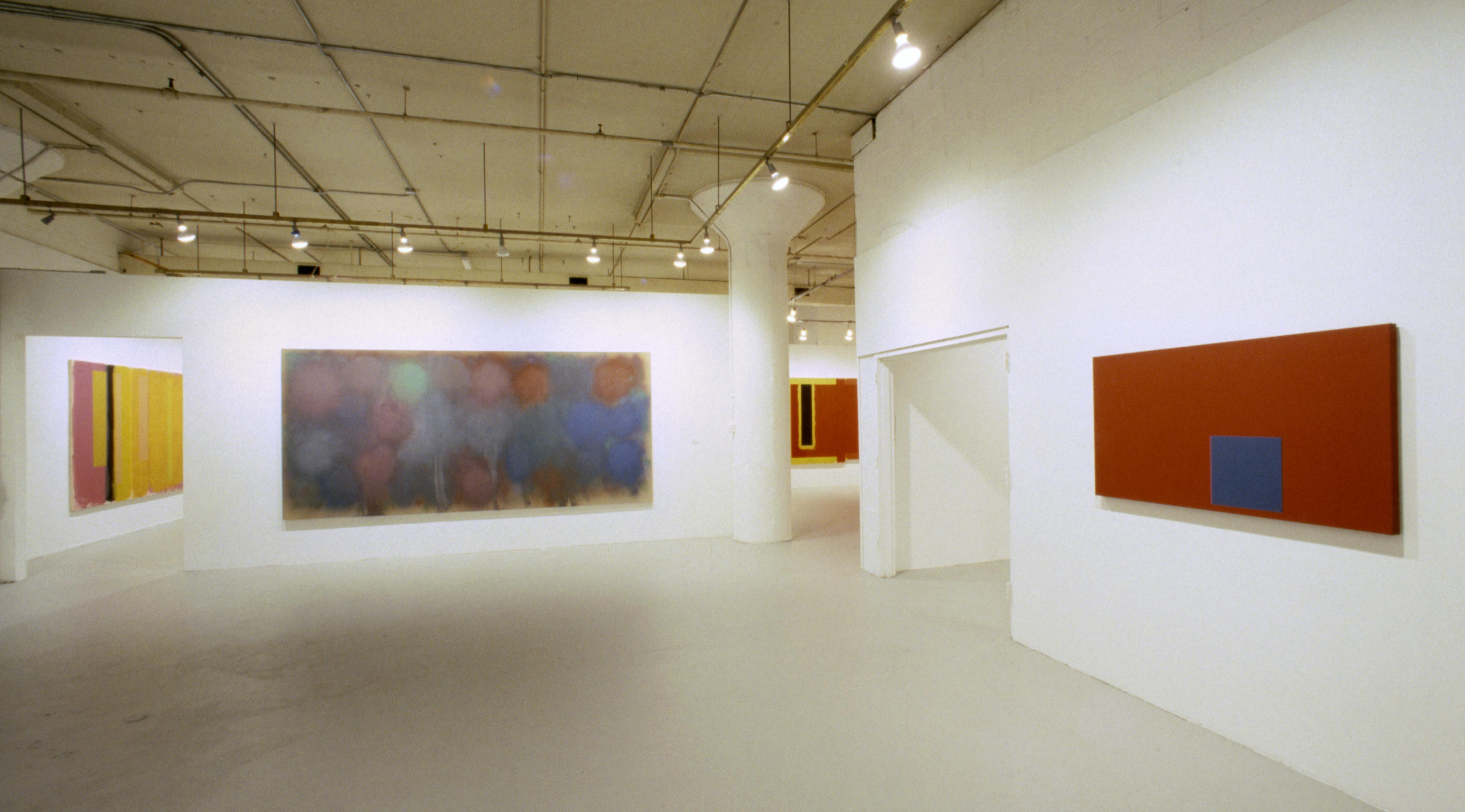
Covering 20 years of this prolific abstractionist’s output, A recent New York exhibition examined the visual and metaphorical subtleties of his large-scale paintings.
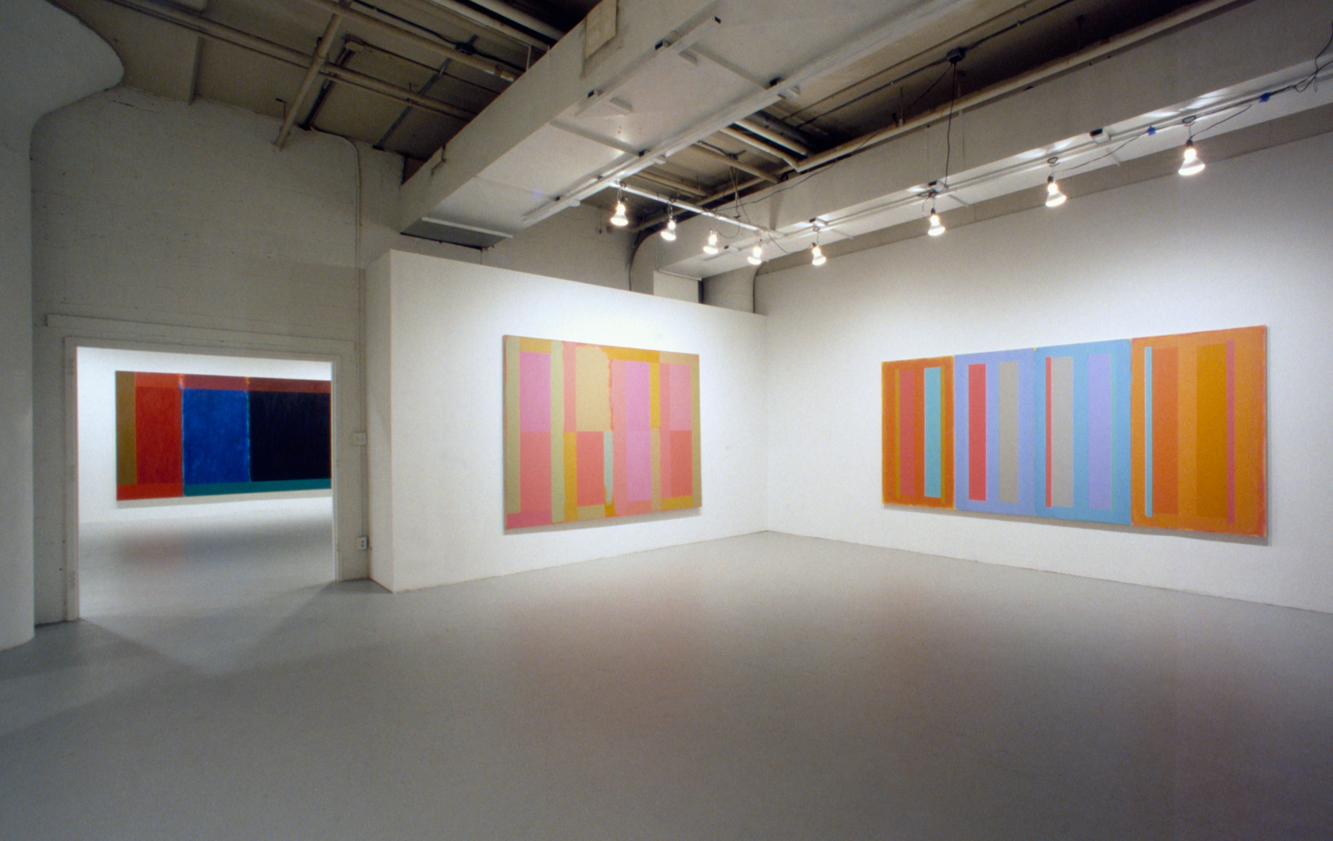
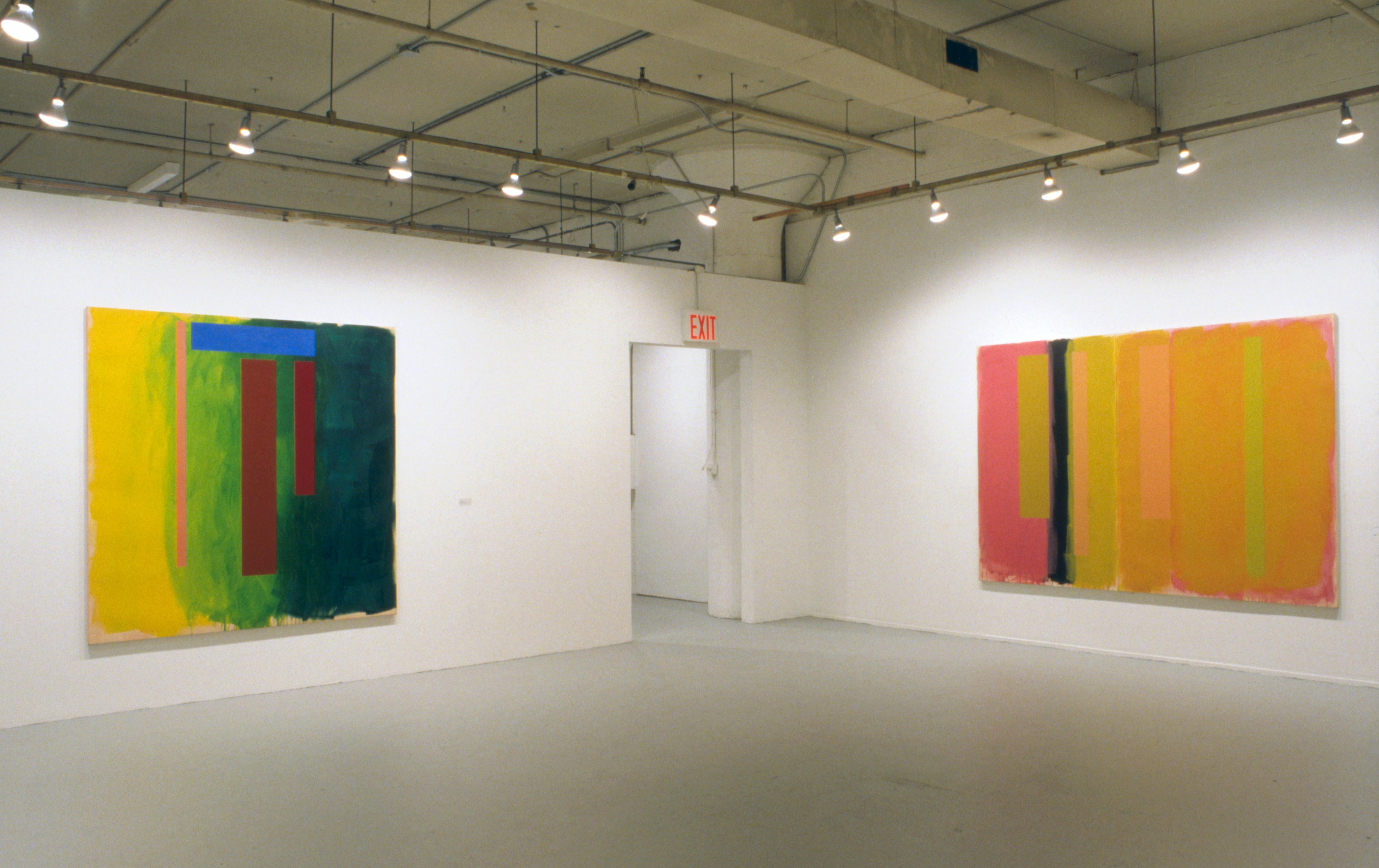
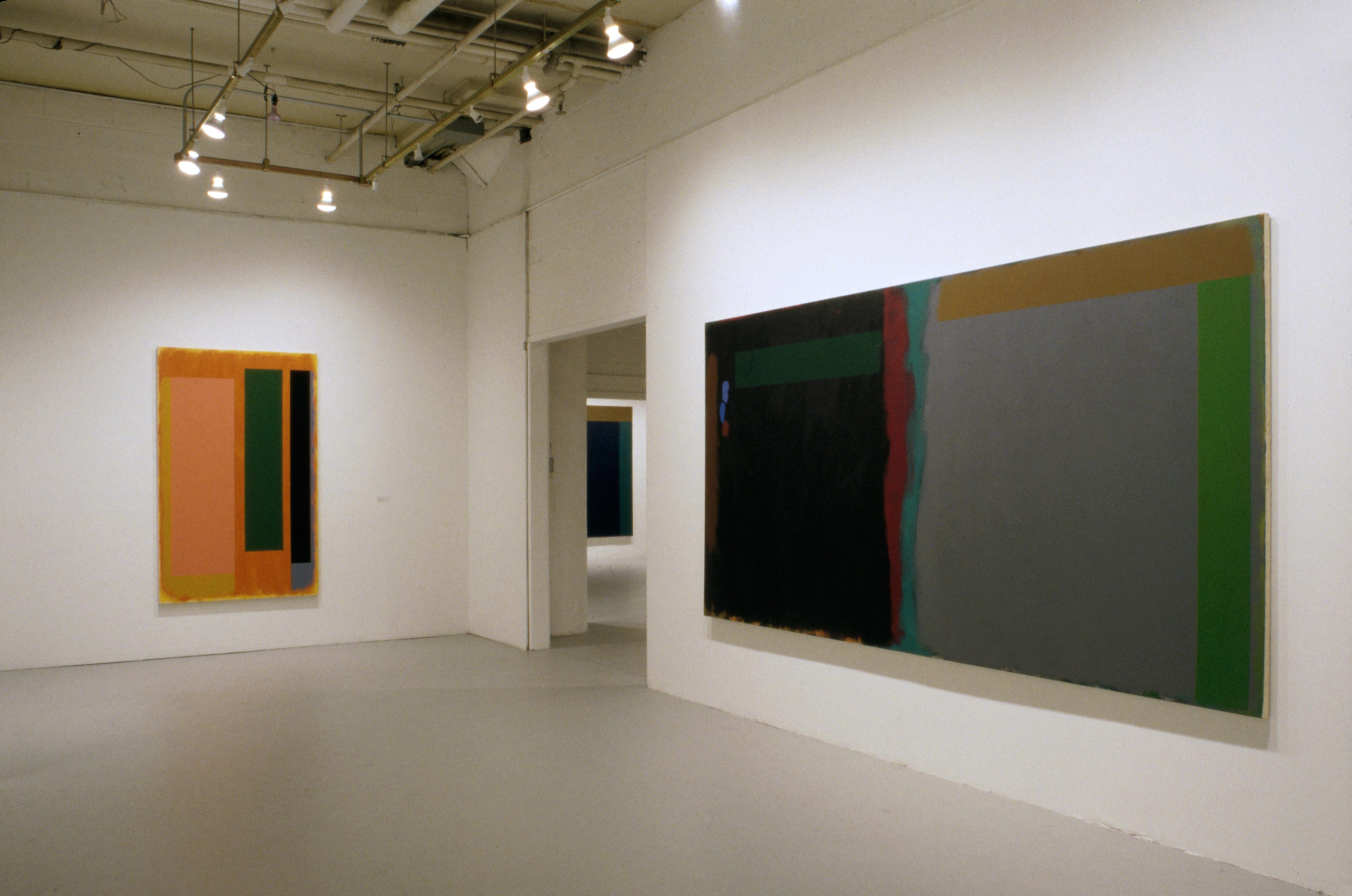
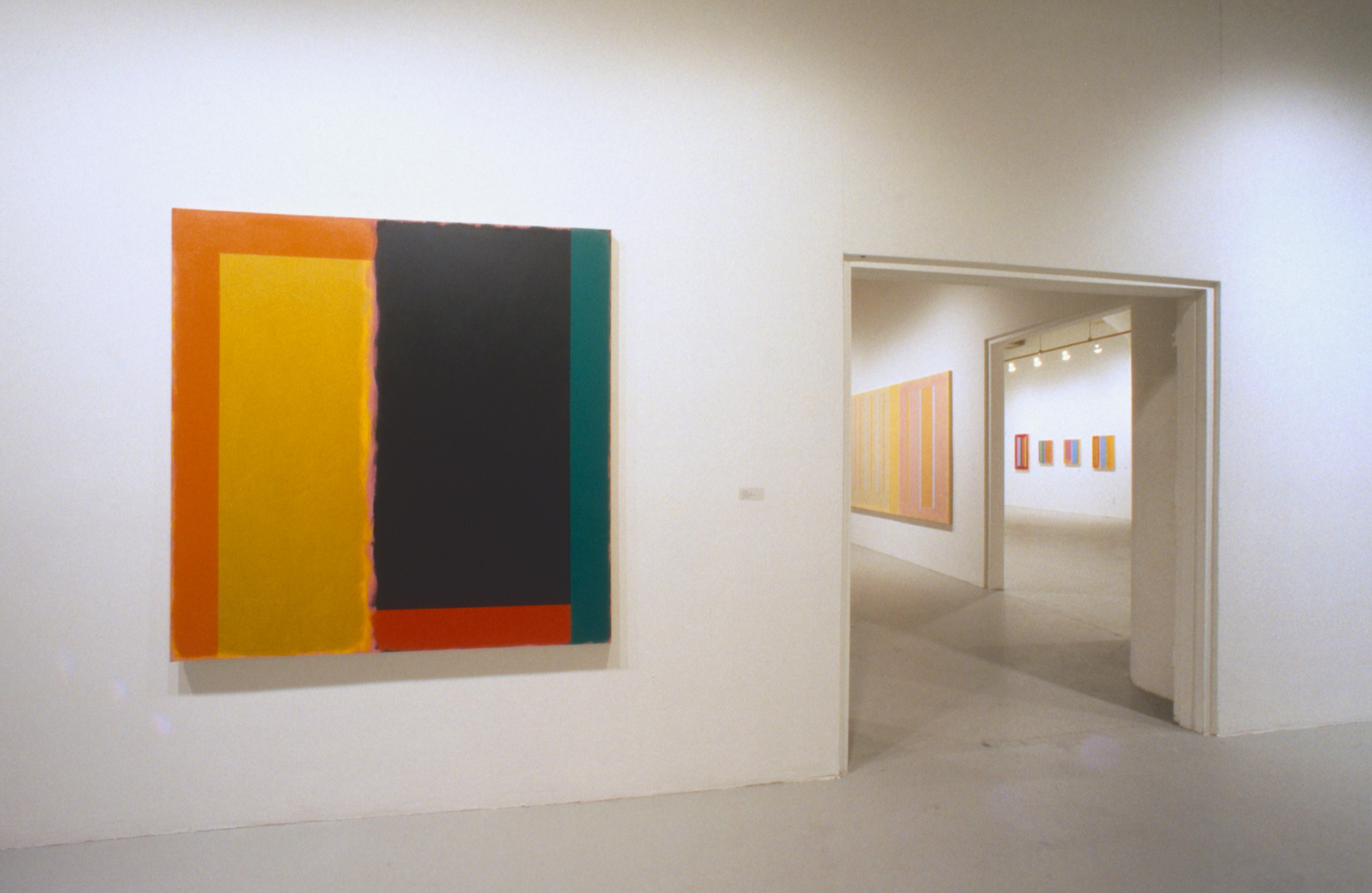
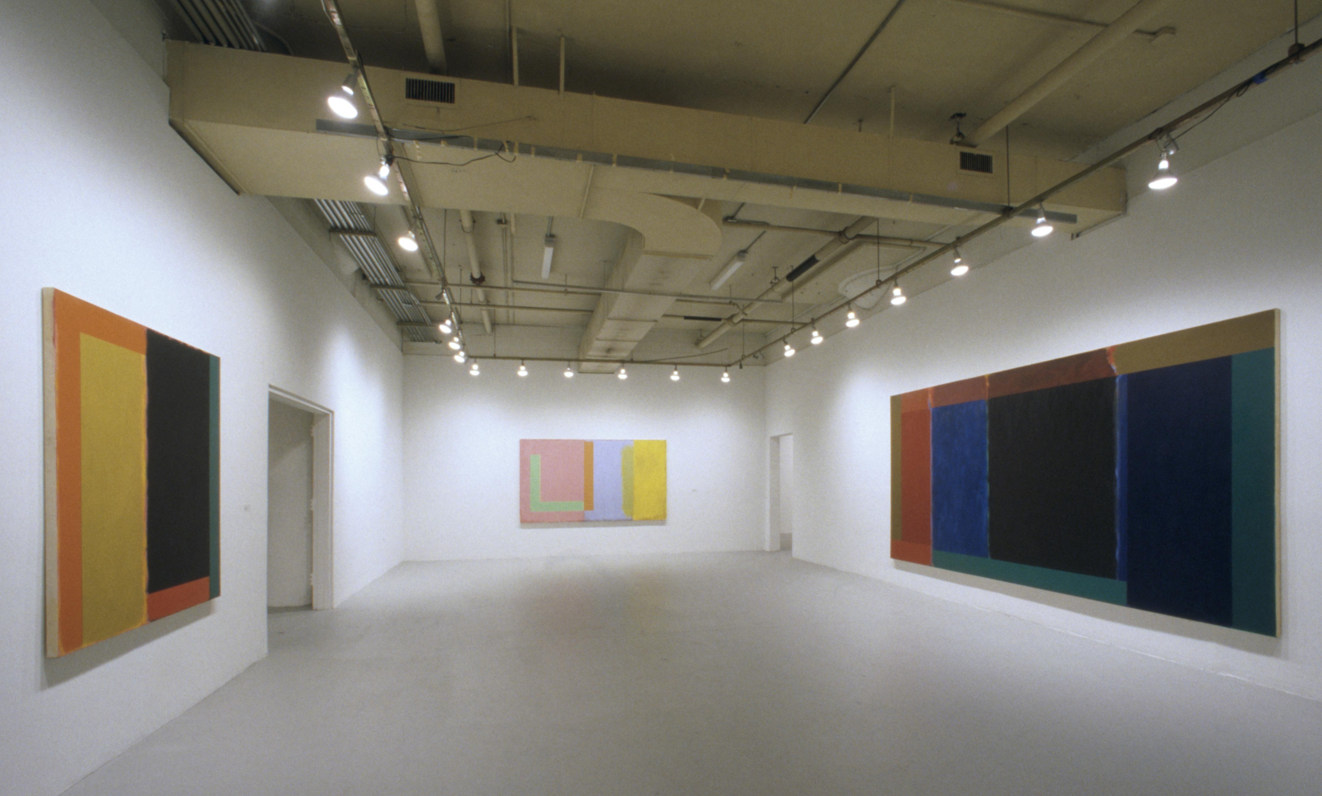
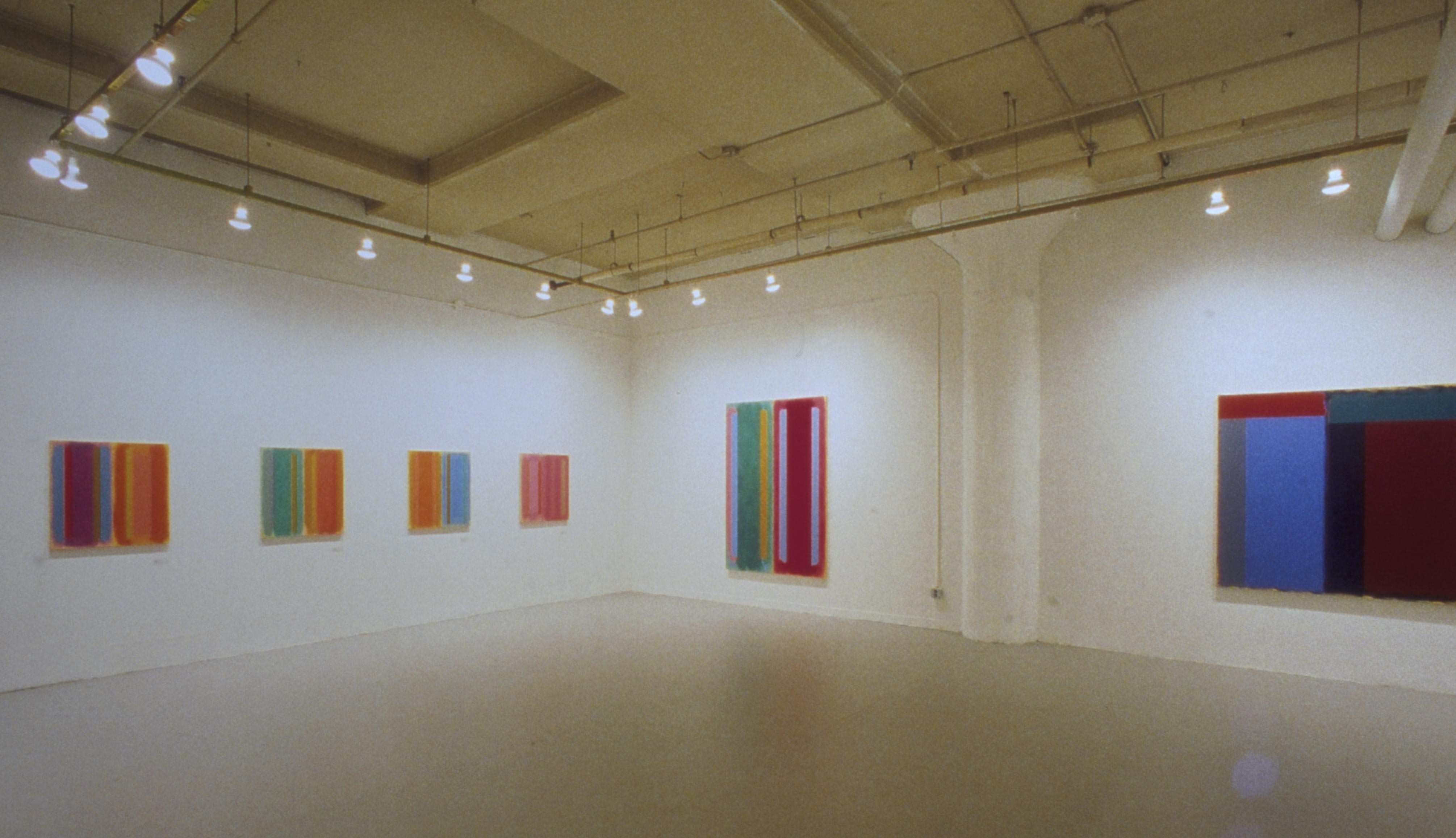
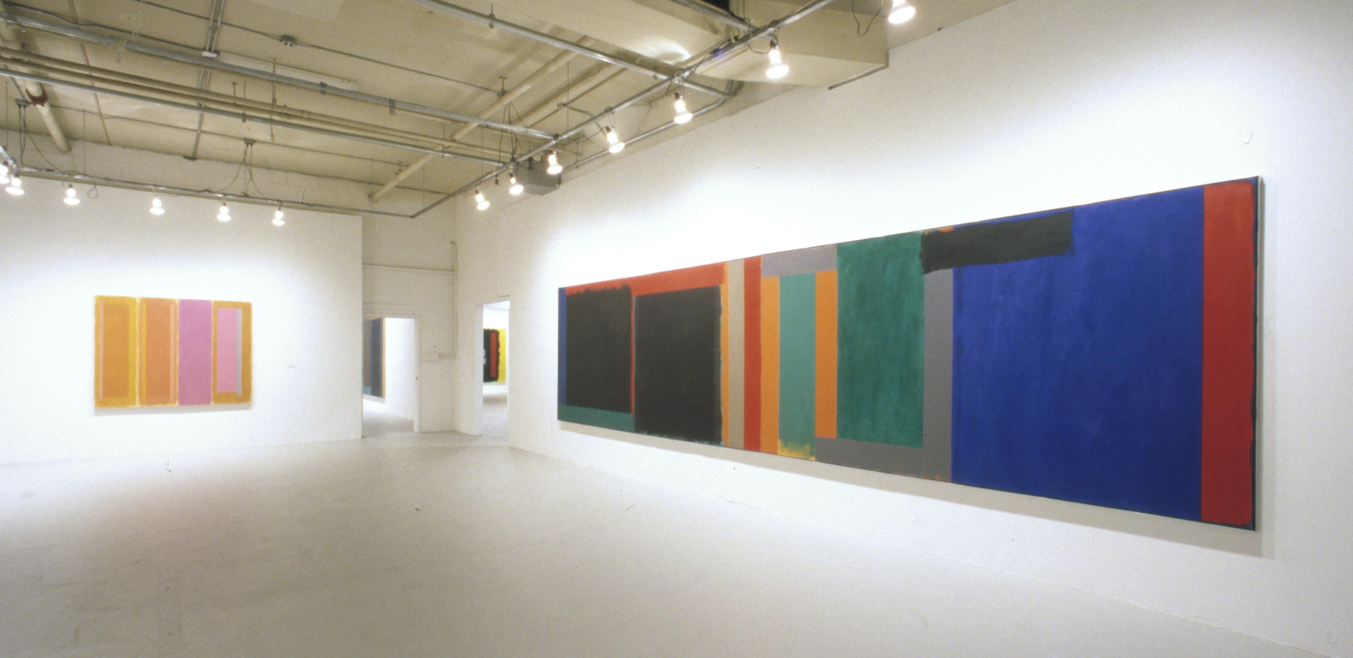
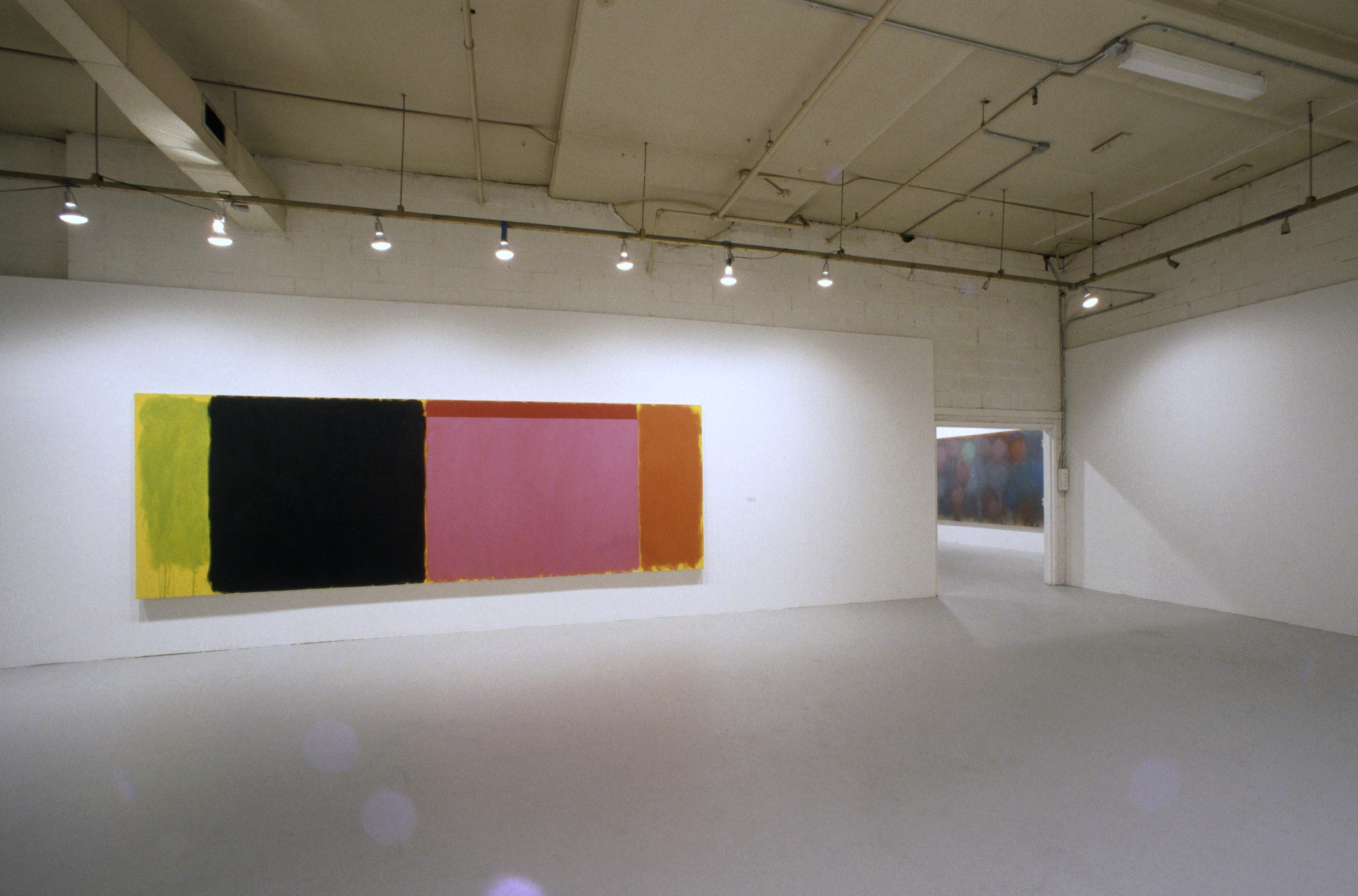
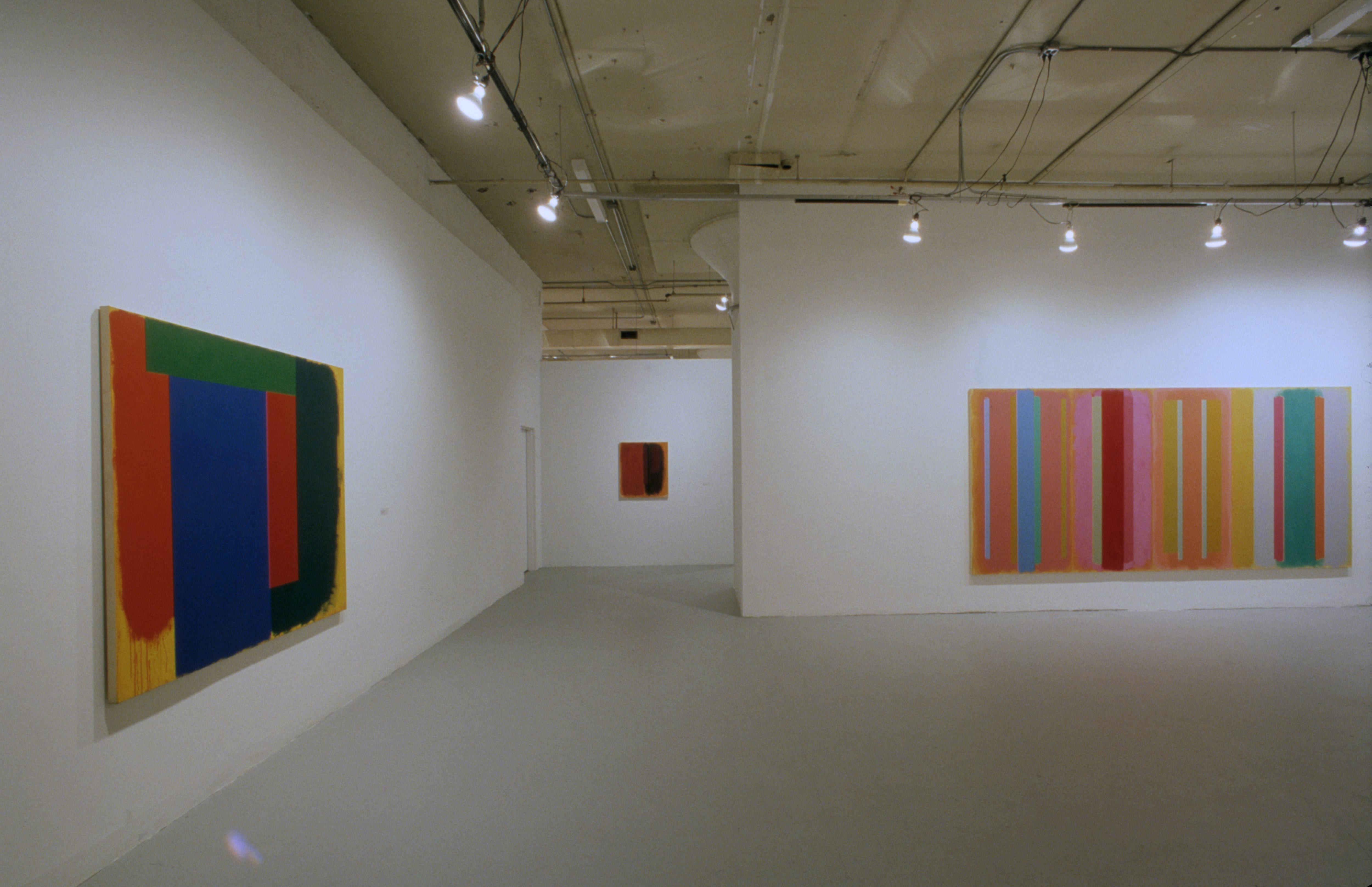
Since the mid-1960’s, Doug Ohlson has been making large paintings from blocks and bands of color. Having established these premises, he has stuck with them, giving his oeuvre a sweeping consistency. Whatever faith a long career as an abstract painter requires, Ohlson has kept it, unwaveringly but never predictably. Every season he offers surprises, usually subtle but sometimes not. In 1982, he made a basic change in the way his images work. Until that year, his pigments had been opaque. Then, as the art historian Richard Stapleford notes, “he began to use translucent colors loosely painted in large, adjacent panels. Pictorial space in his earlier work was created by the vibration between two…colors. With these new translucent colors, surface and depth are redefined as within the picture space, not in front of it.”
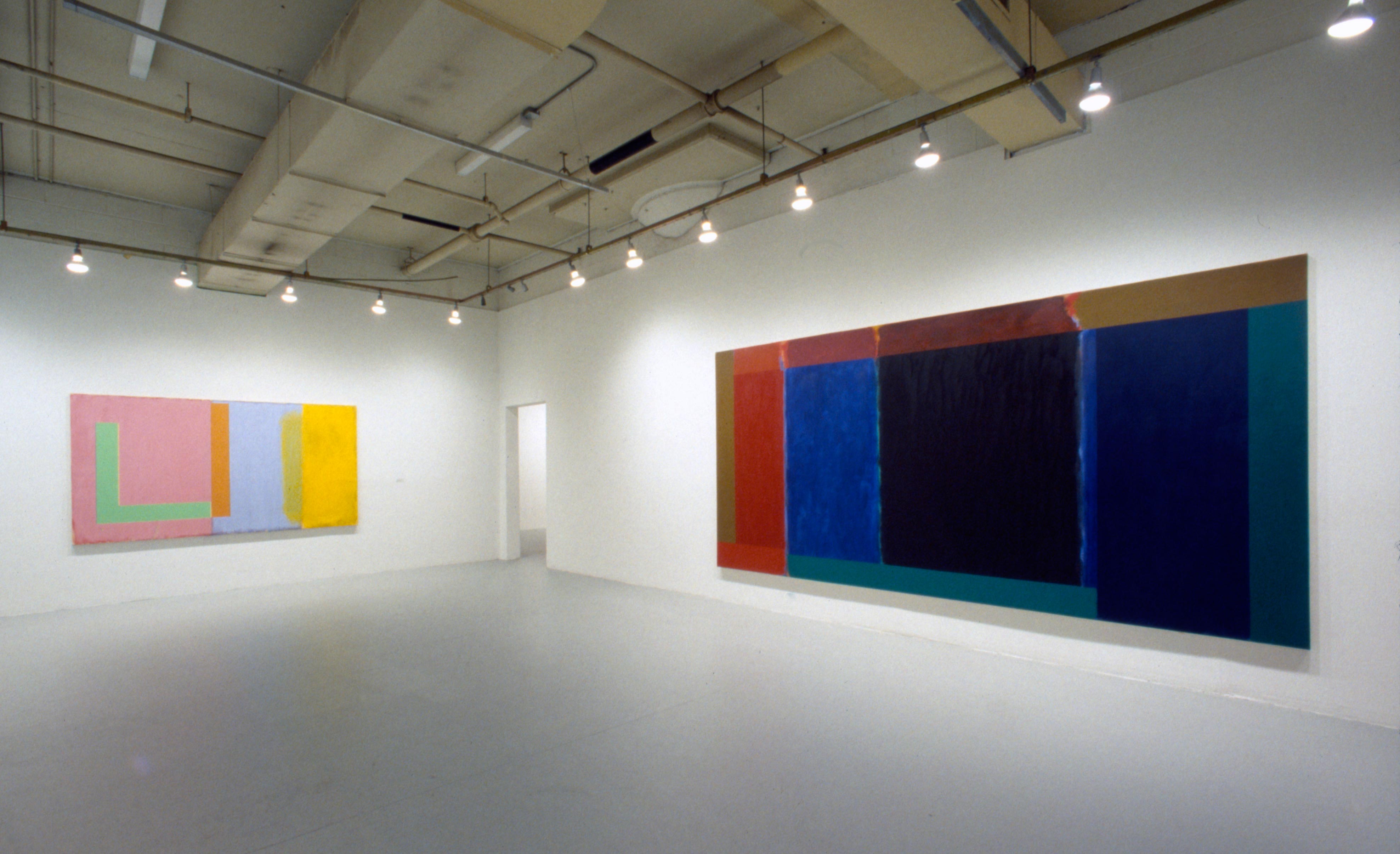
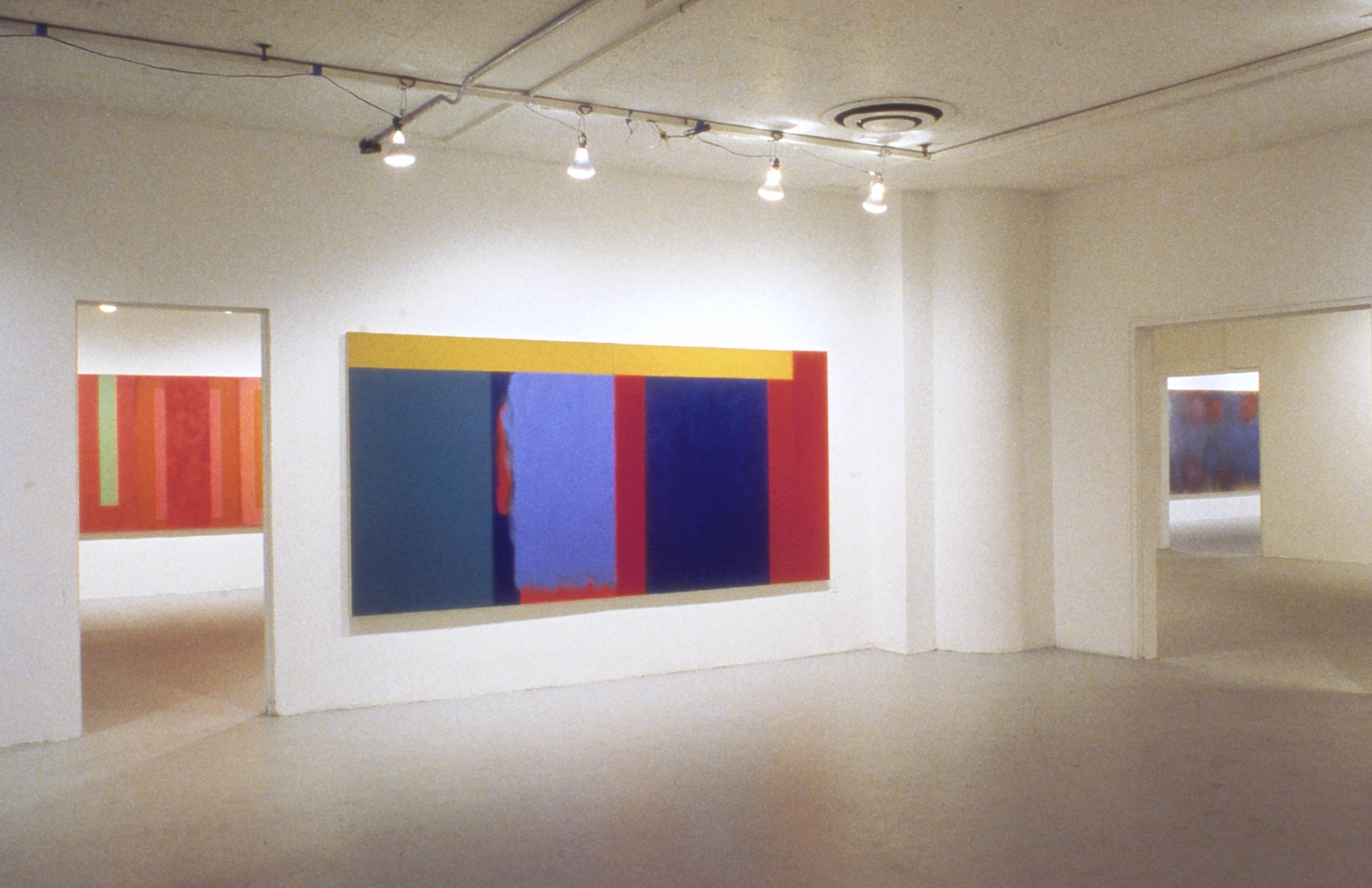
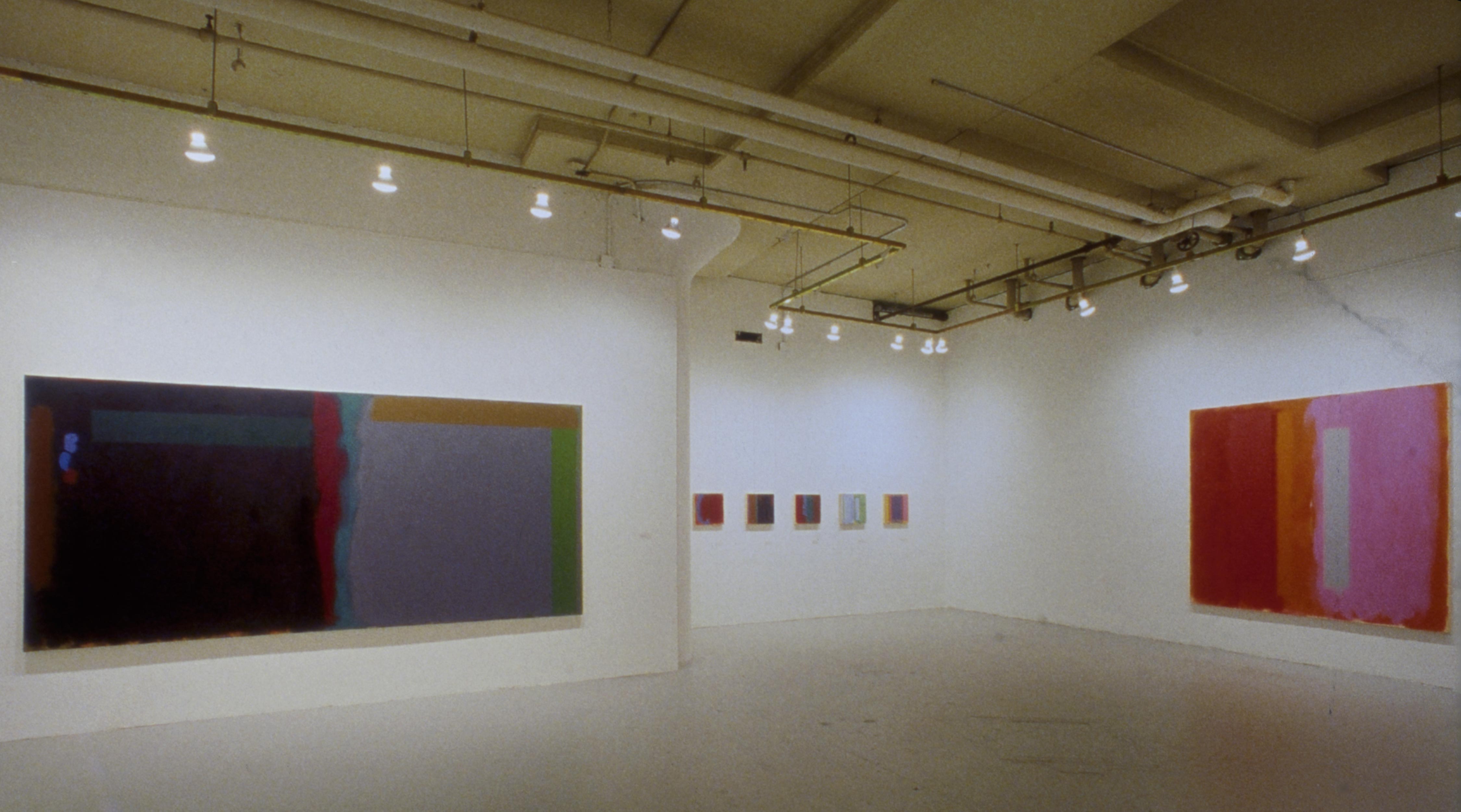
Stapleford’s remarks appear in his introduction to the catalogue of “Doug Ohlson”, 20 years of Painting: 1982 – 2002,” a show he organized for the Times Square Gallery of Hunter College. Housed on the ground floor of a building on West 41st Street, just off Tenth Avenue, this is a huge exhibition space featuring lofty ceilings and galleries that range from small to medium to cavernous. Art can get lost here, though thee was no risk of that in the Ohlson show. In part, this was because Stapleford built the exhibition around a handful of very large canvases. Considered simply as an object, the 23-foot-wide Second Wind (1982), for example, had no trouble holding the wall. Nearly 6 feet high, this painting is a wall, of sorts. As you approach, its physical presence brings you up short. Then you keep going for a closer look at the surface, drawn in by Ohlson’s seductive brushwork.Not that he slathers on the pigments with de Kooningesque munificence. A better comparison is to Mark Rothko, whose thin, translucent layers of paint give luminosity even to purple verging on black. On the left-hand side of Second Wind, Ohlson placed two large black rectangles, separating them with wavering streaks of orange and slatey blue. At first glance, the rectangles look flat, velvety and light-absorbent. Yet these expanses of black are just as airy as the red and oranges abutting them- and just as radiant, paradoxical as that sounds. Ohlson sometimes gives feathered edges to his squared-away shapes. More often, edges are crisp. Always, tough, his brushwork is limber and calm. As he covers the canvas, modulating tones and textures, he stirs pictorial light into his colors, even the darkest. As Stapleford suggests, this light radiates into depths.
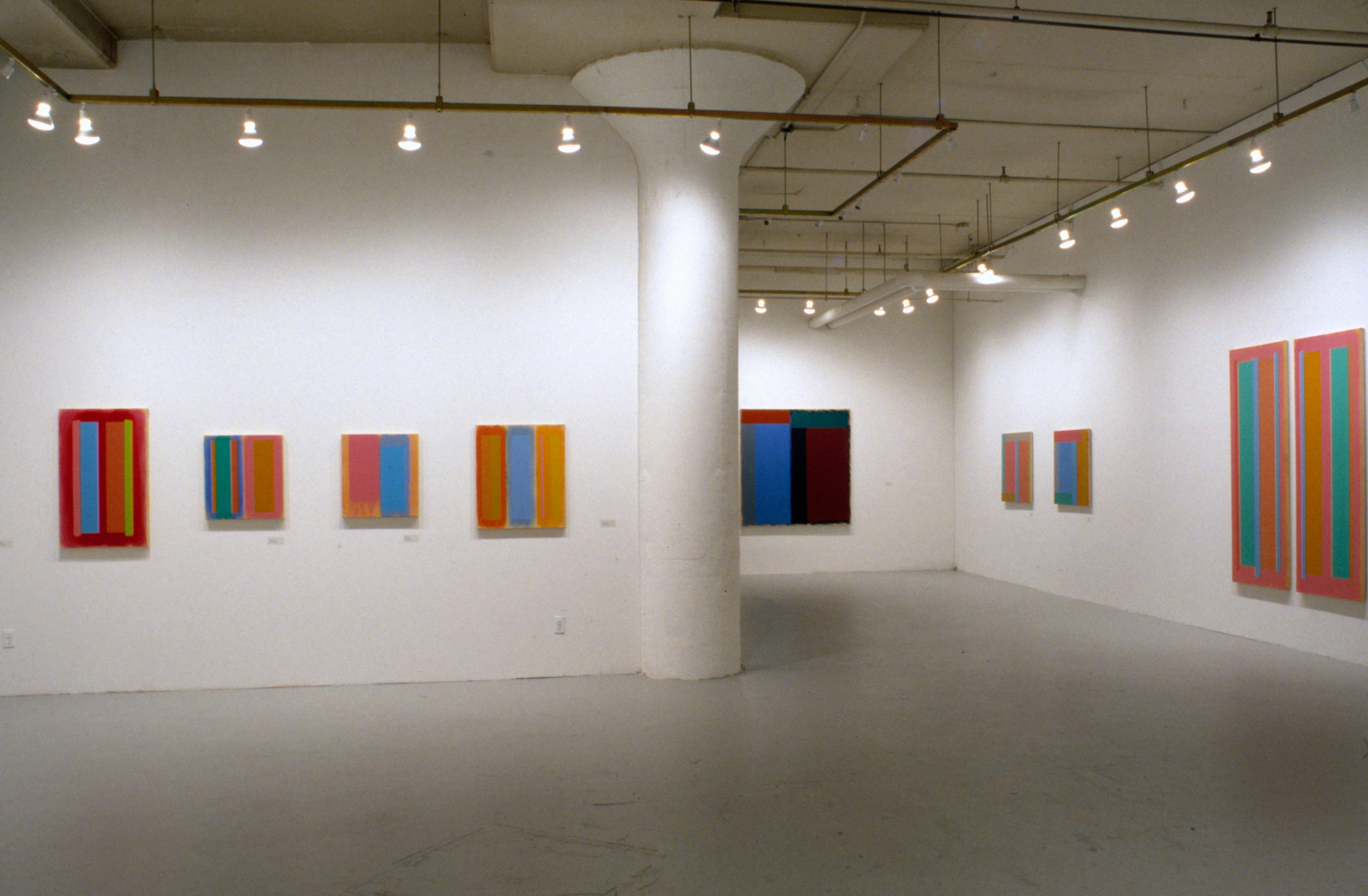
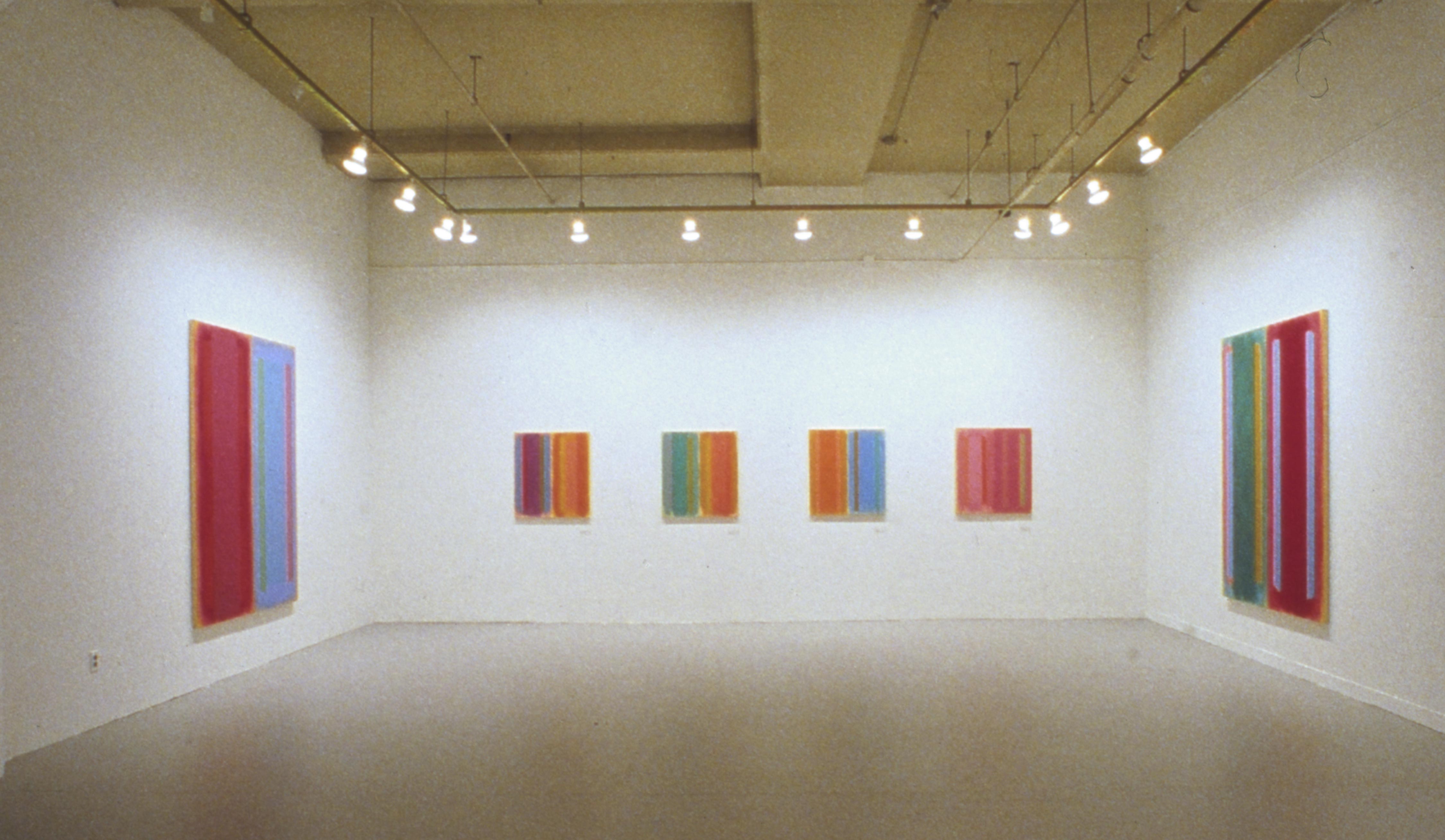
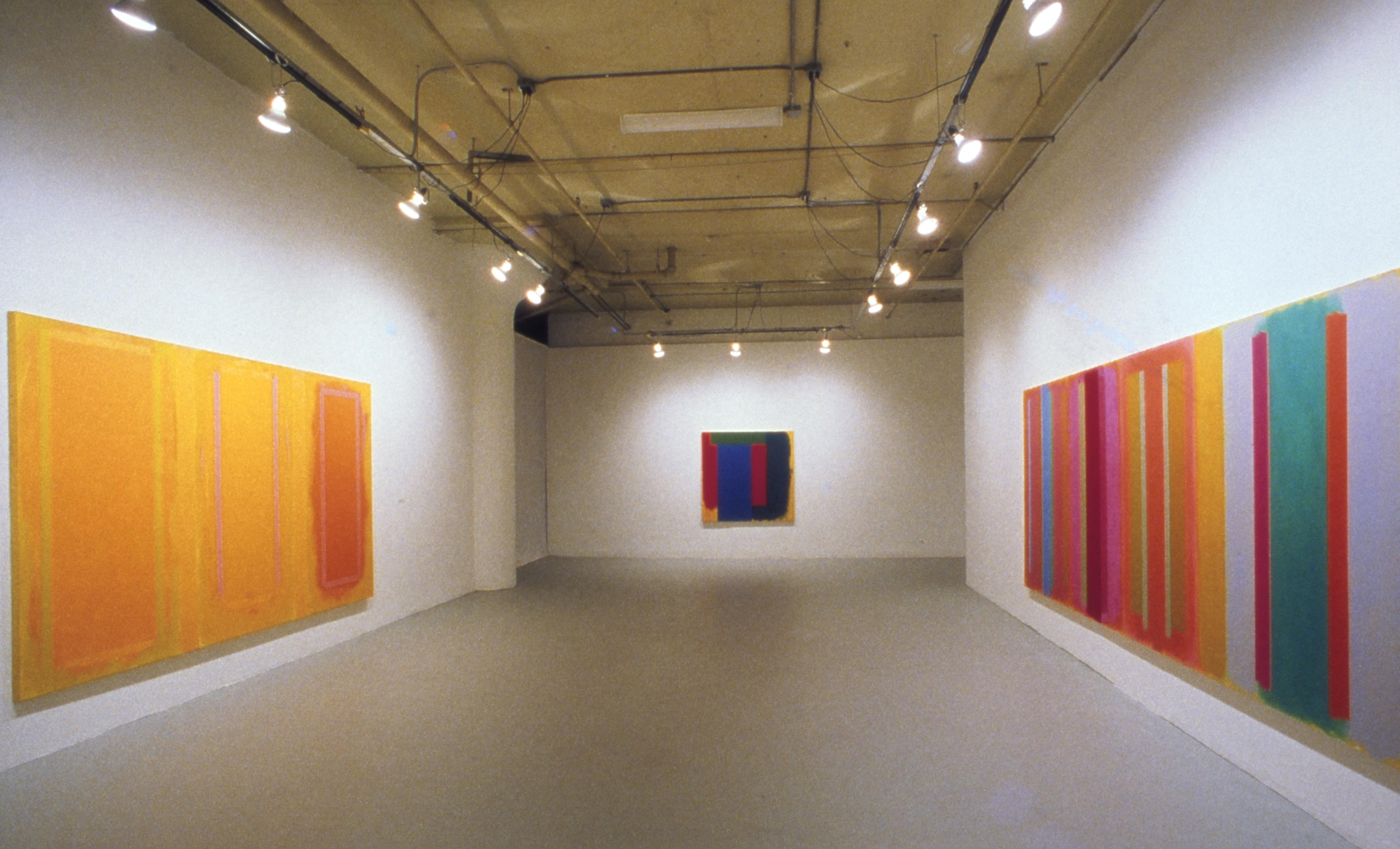
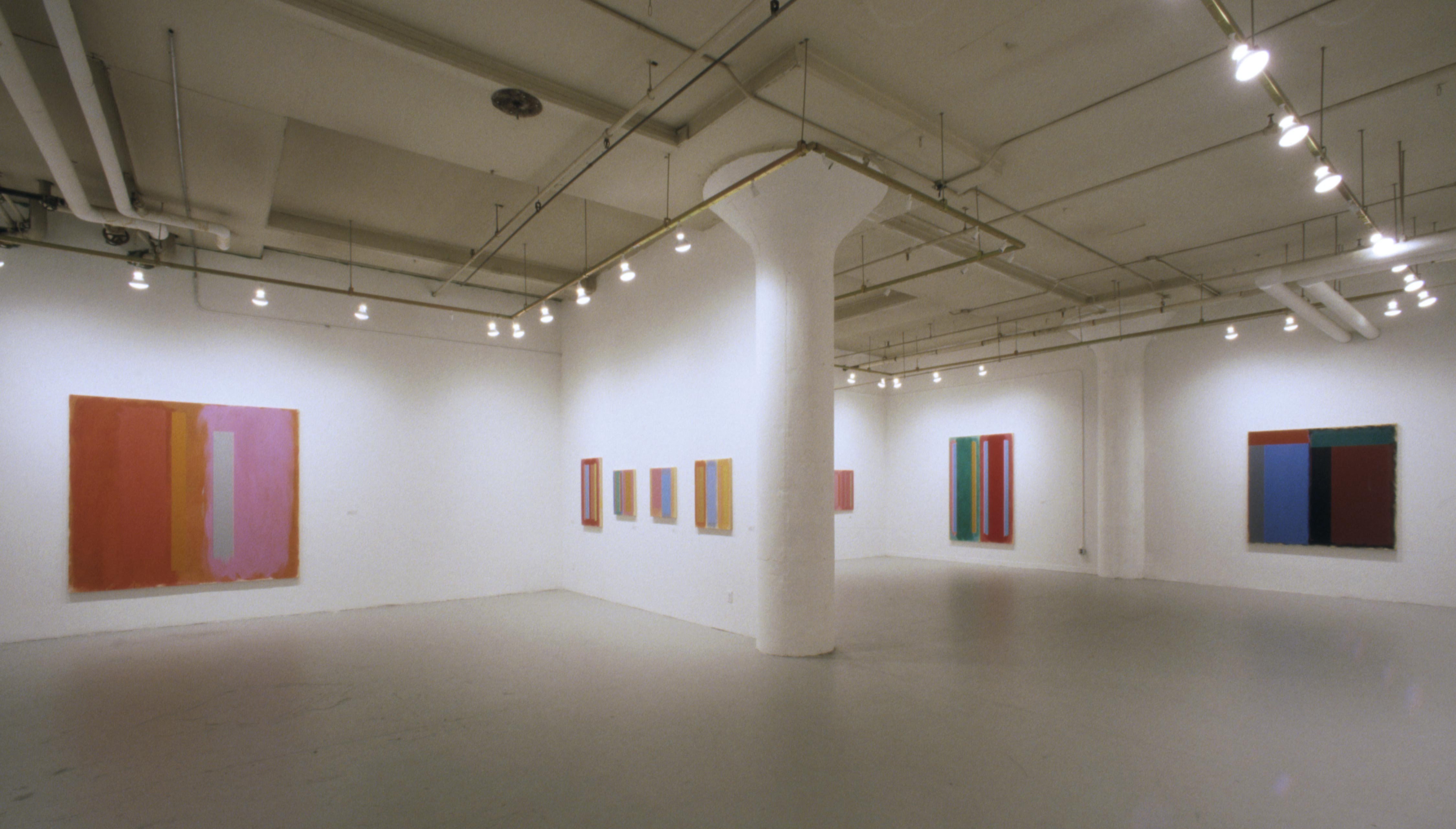
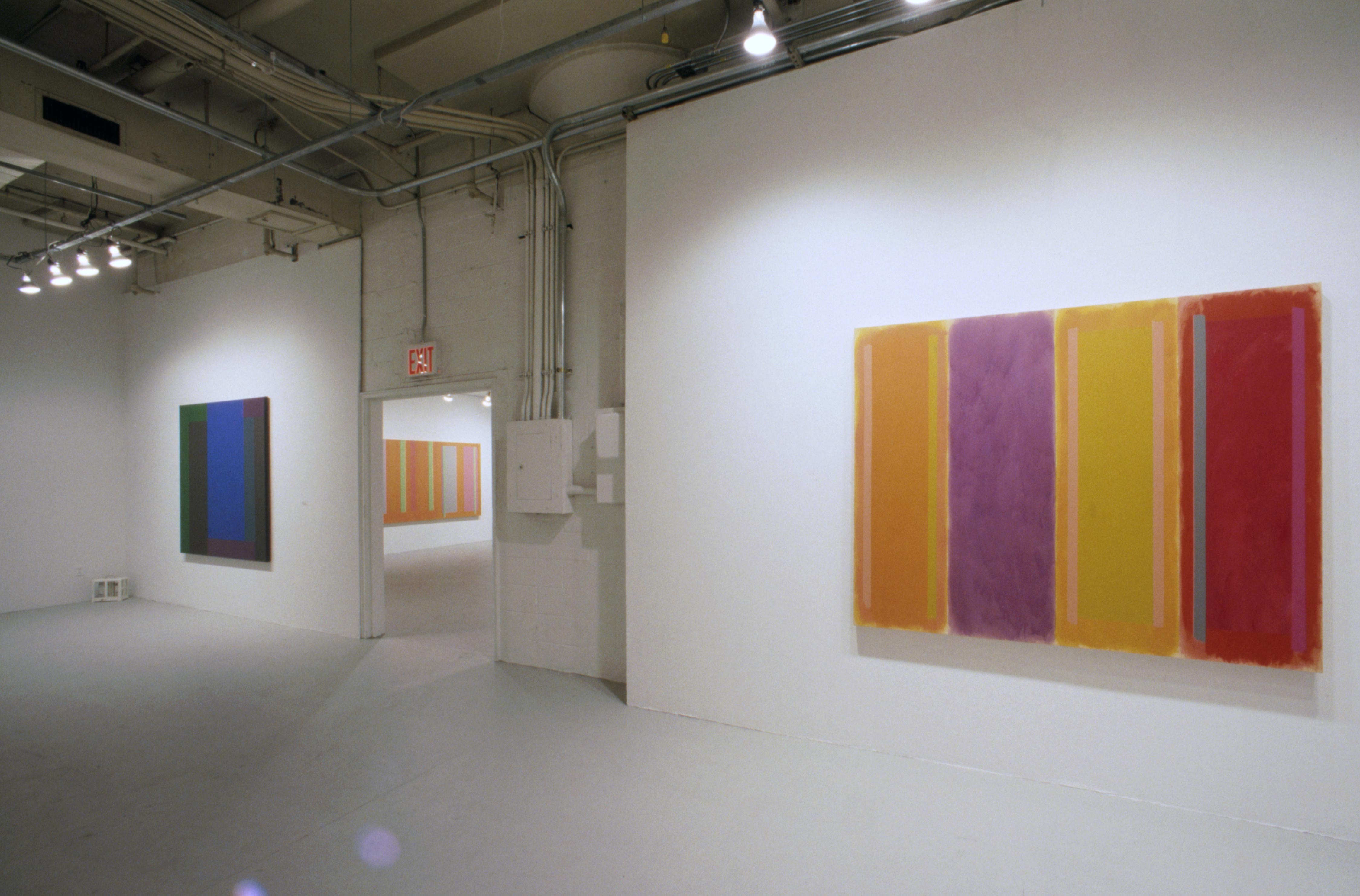
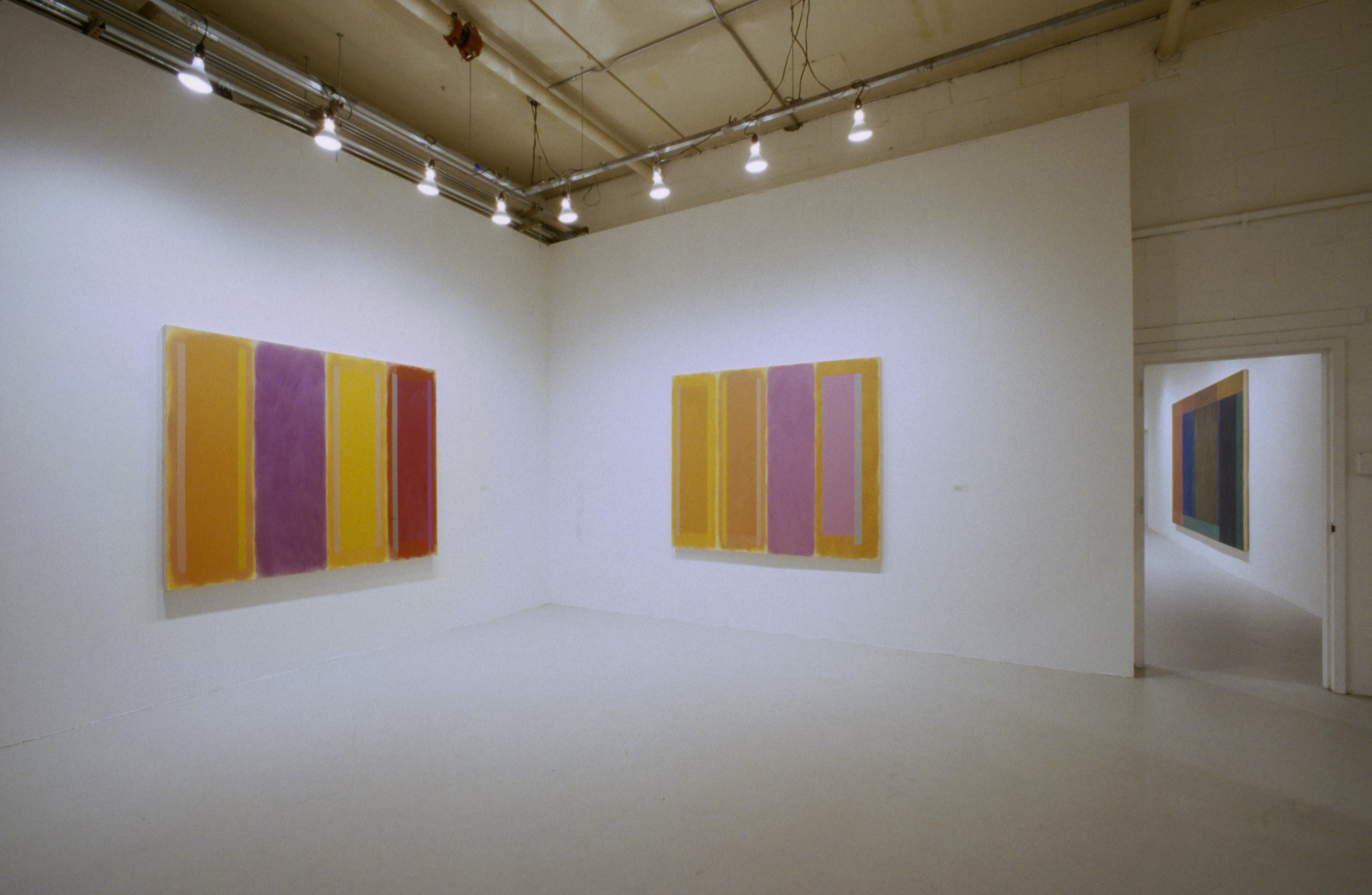
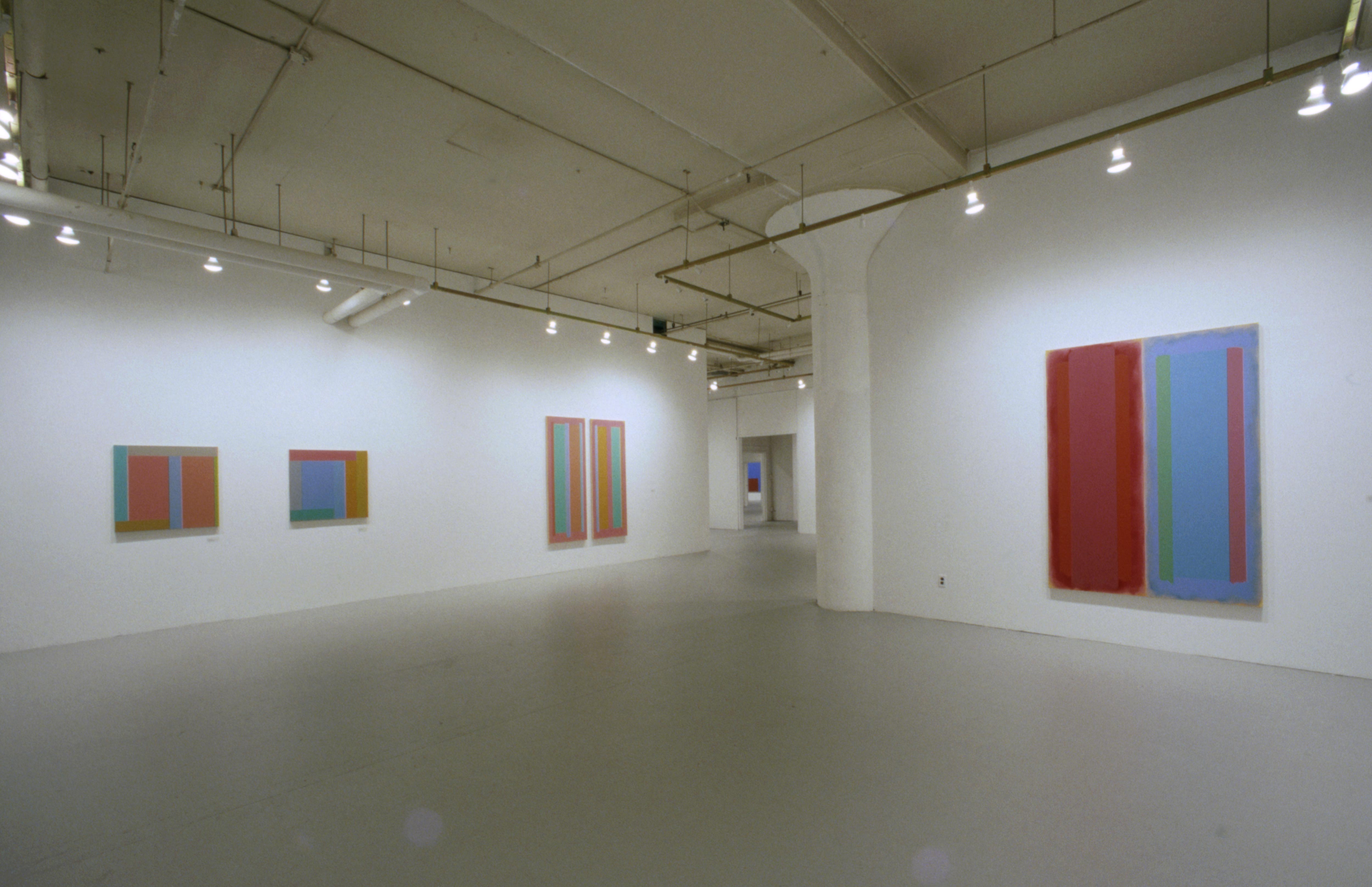
The darker the tone, the farther back it seems to reach. The lighter hues move both ways at once, into depth and out to us. The summary colors of Roussillon (1997), another huge painting, fill a room with serenely flickering light. Ultimately, of course, these bright reds and blues settle onto the canvas. Though he is capable of juxtaposing colors in genuinely jarring combinations – pinks against oranges, lime greens against vermilions – Ohlson never lets a form pop off the canvas in a way that literally fools the eye, in the manner of Op art. On the contrary, he encourages us with the self-evident clarity of his formal devices to see precisely how he puts a painting together.
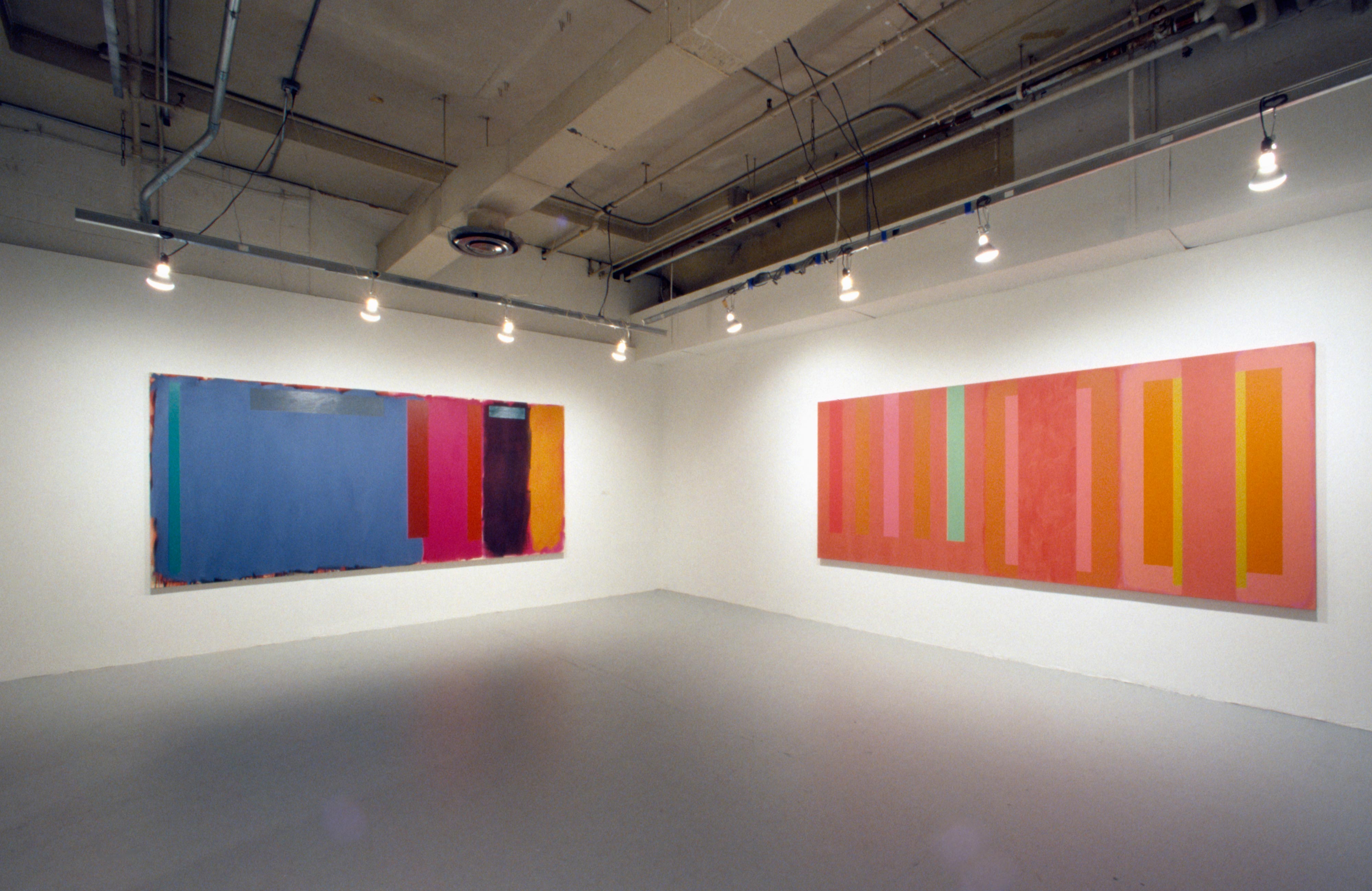
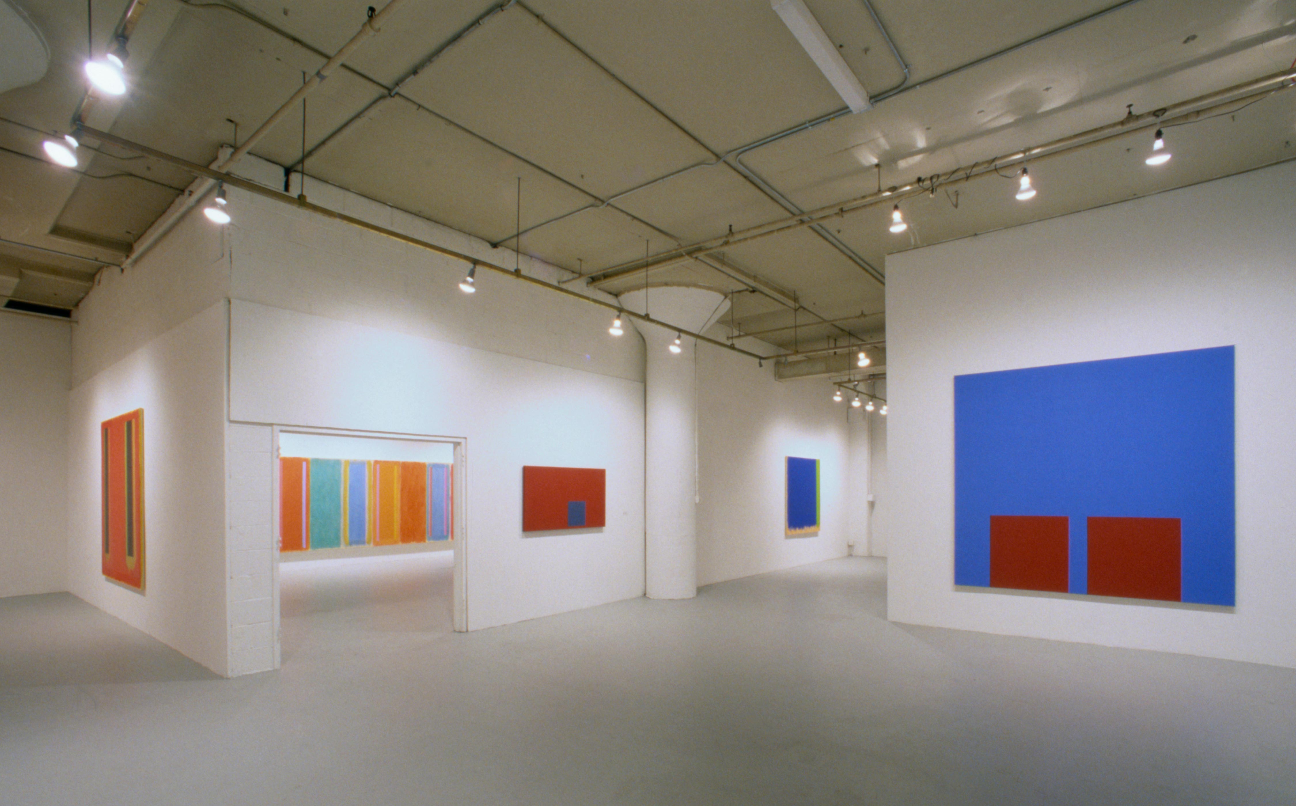
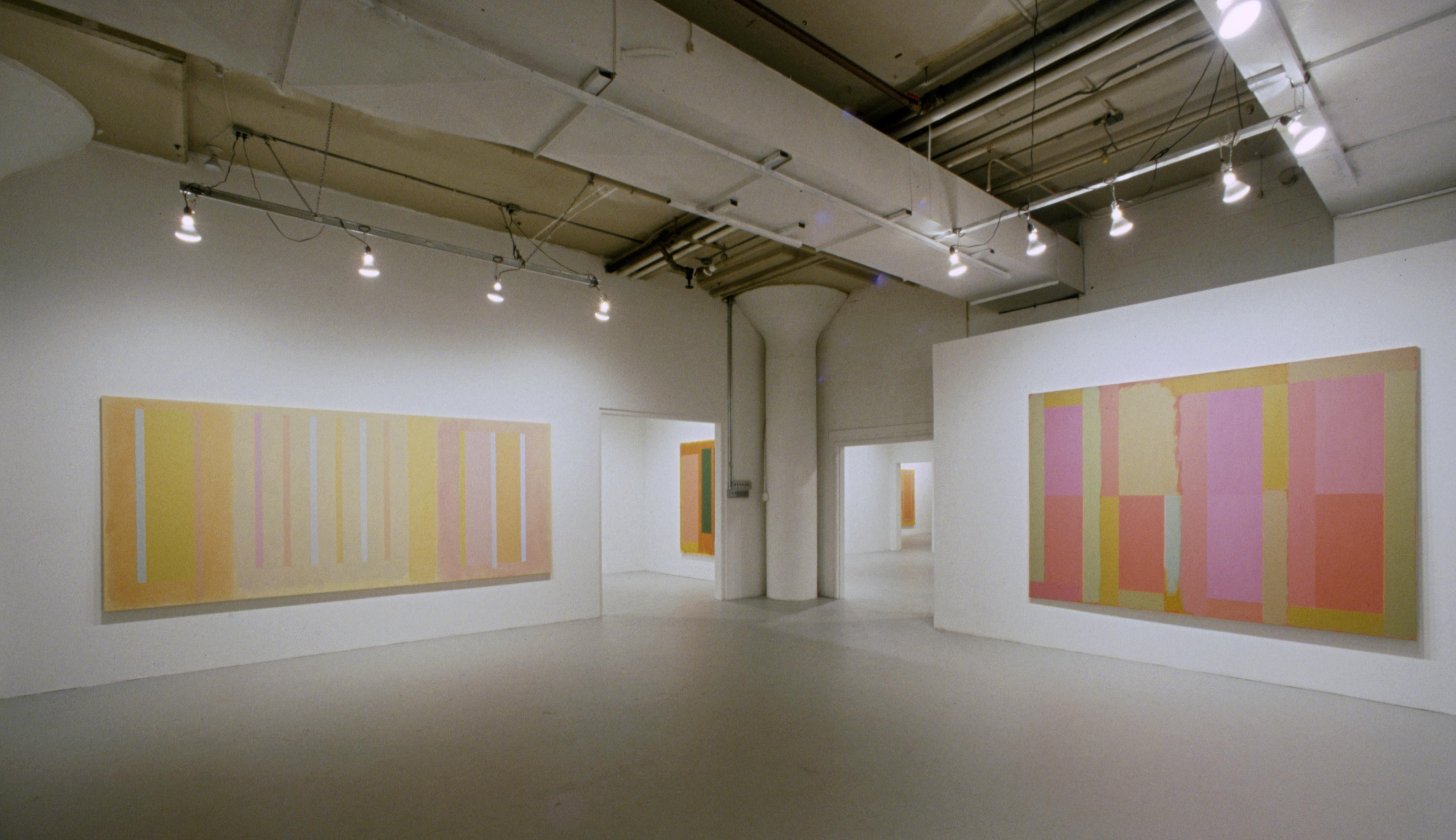
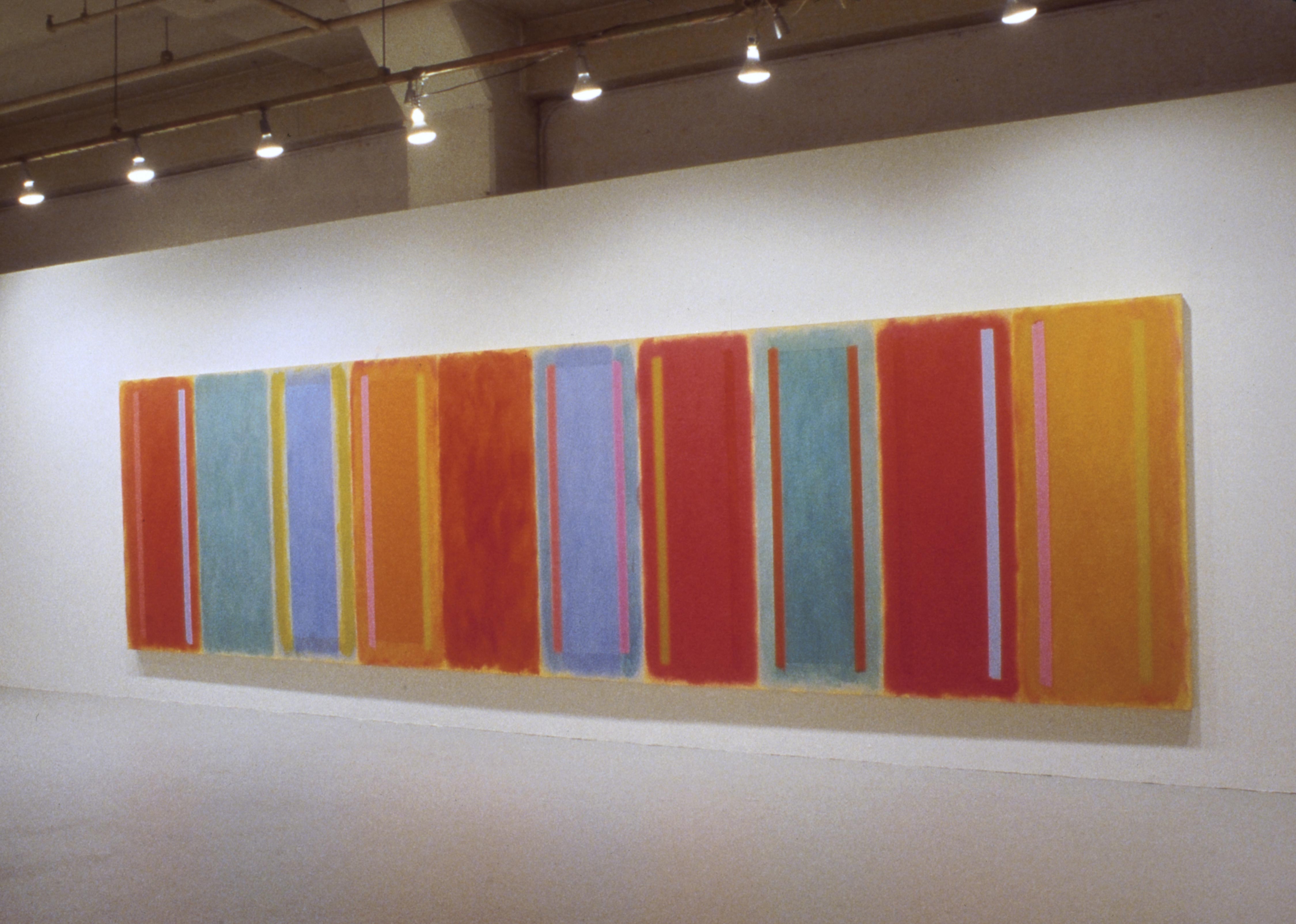
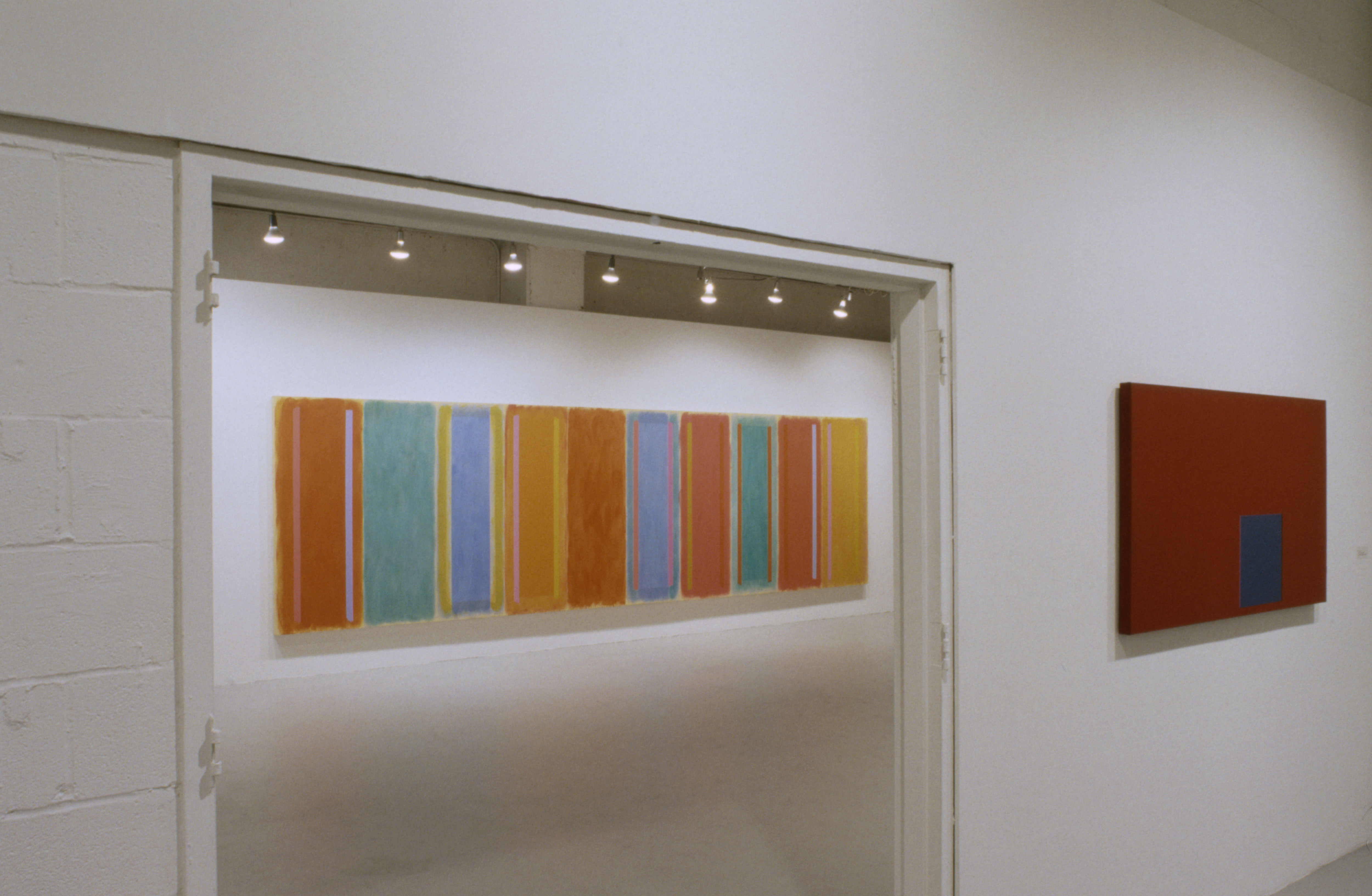
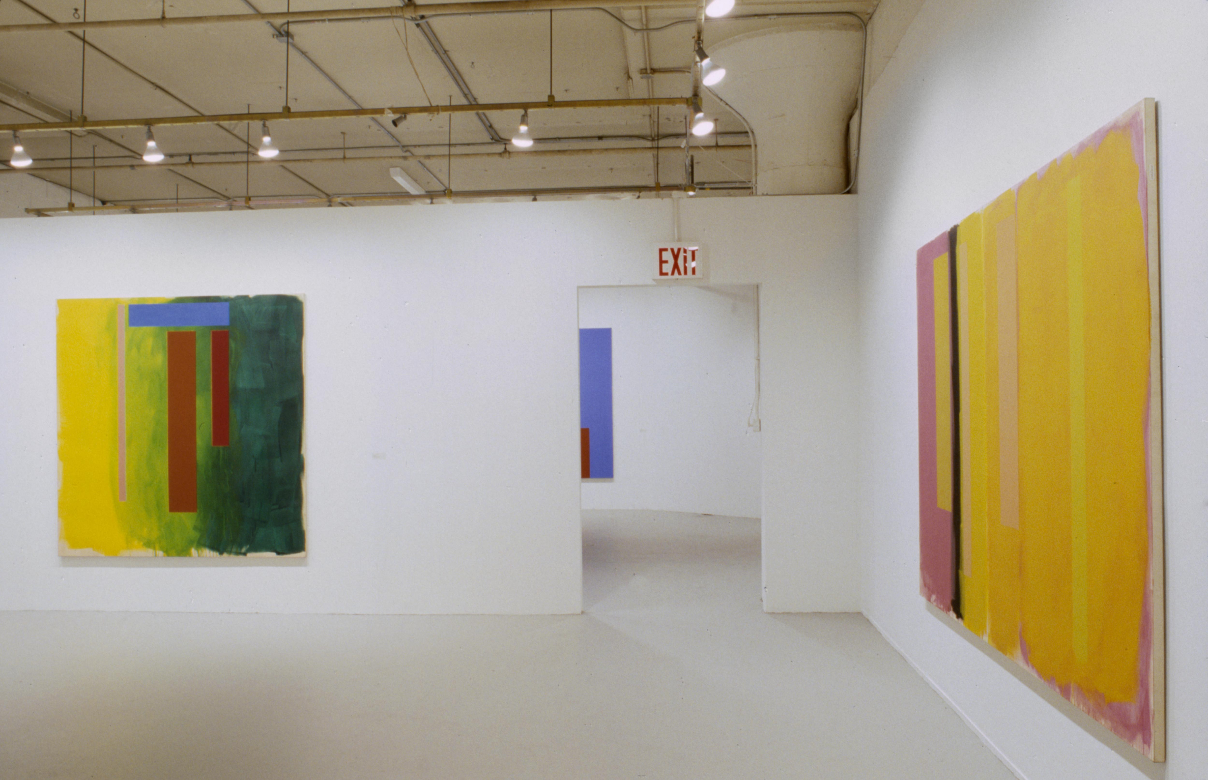
Ranging in color from black to delicate yellow, the variously proportioned rectangles of Peep Show (1993) all maintain a precisely calibrated distance from the picture plane. Overall, the painting has an air of gravitational resolution, as if a play of similarity and contrast – or, in Newtonian terms, of attraction and repulsion – had brought these disparate forms into a harmonious balance. Yet the harmony is not completely resolved. There are dissonances, which give me the feeling I have never seen Peep Show once and for all. A subtle shock on first viewing, the clash of lemony green against yellowish ocher along the right-hand edge remains surprising, no matter how many times I look at it. To the left, Ohlson has given a thin orange bar the task of mediating between a large block of lighter orange and a block of blue with cloudy edges. The orange bar does its job well, yet it looks to me as if the blue block puts an inordinate strain on this three-way relationship. Surely deliberate, this tension generates the pictorial energy needed to balance the slab of black to the right.
It is difficult to account for the vitality of a successful abstract painting. I think it must have to do with dissonances of the kind I’ve been describing. Almost offhandedly, Ohlson dares us to make sense of these chromatic clashes and spatial discords. When we take up the dare, things come alive: our memories, our imaginations and ultimately the paintings. Ohlson takes guidance from modernist history, though of course he has rewritten the canon to his own specifications. I’ve already mentioned the visual echoes of Rothko’s light. In addition, the lateral spread of so many of Ohlson’s canvases makes him a direct heir of Barnett Newman and the entire tradition of the post-war sublime. Thus Jackson Pollock’s drip painting are important to him, for their scale if not for their look, but no more so than the big, light-filled canvases of Henri Matisse. Unlike the Minimalists, whose literalism had a powerful effect on his work in the 1960’s and ‘70s, Ohlson has never boxed – or painted - himself into an all-American corner. His respect for European modernists is passionate and sometimes surprising. In the interview published in the catalogue of his recent show, Ohlson declares his admiration for the small, bleached out still lifes of Giorgio Morandi. Though he doesn’t explain this liking – Ohlson tends not to explain anything – it must have something to do with the luminosity Morandi’s brushwork builds into his unassuming forms.
In its broadest outlines, the history of modernist painting is a story about the medium discovering its flatness and losing track of its figurative impulse – that is, a story about the emergence of abstraction. In fact, the figure has a secret life in much abstract painting, for we read painterly gestures as traces of a human presence. Moreover, we sometimes see the figure in an abstractionist’s thin, upright forms Newman’s “zips,” for instance. As tempting as it is to interpret Ohlson’s vertical strips of color the same way, that reading weighs them down and ties them to an invisible horizon. His paintings usually work much better if you let all the elements float.
Ohlson alludes less directly to landscape than to the elements of architecture, especially walls. Hints of floors and ceilings are usually missing, so his walls of color tend to levitate. Luminous and free-floating, they can also be seen as doorways and windows. The feel of landscape returns when one looks through a metaphorical window to an equally metaphorical patch of sky. Yet the architectural quality of Ohlson’s images persists, giving the human figure – the inhabitant of these spaces – an implicit presence. The real human presence, however, is that of the viewer, an obvious fact with subtle consequences.
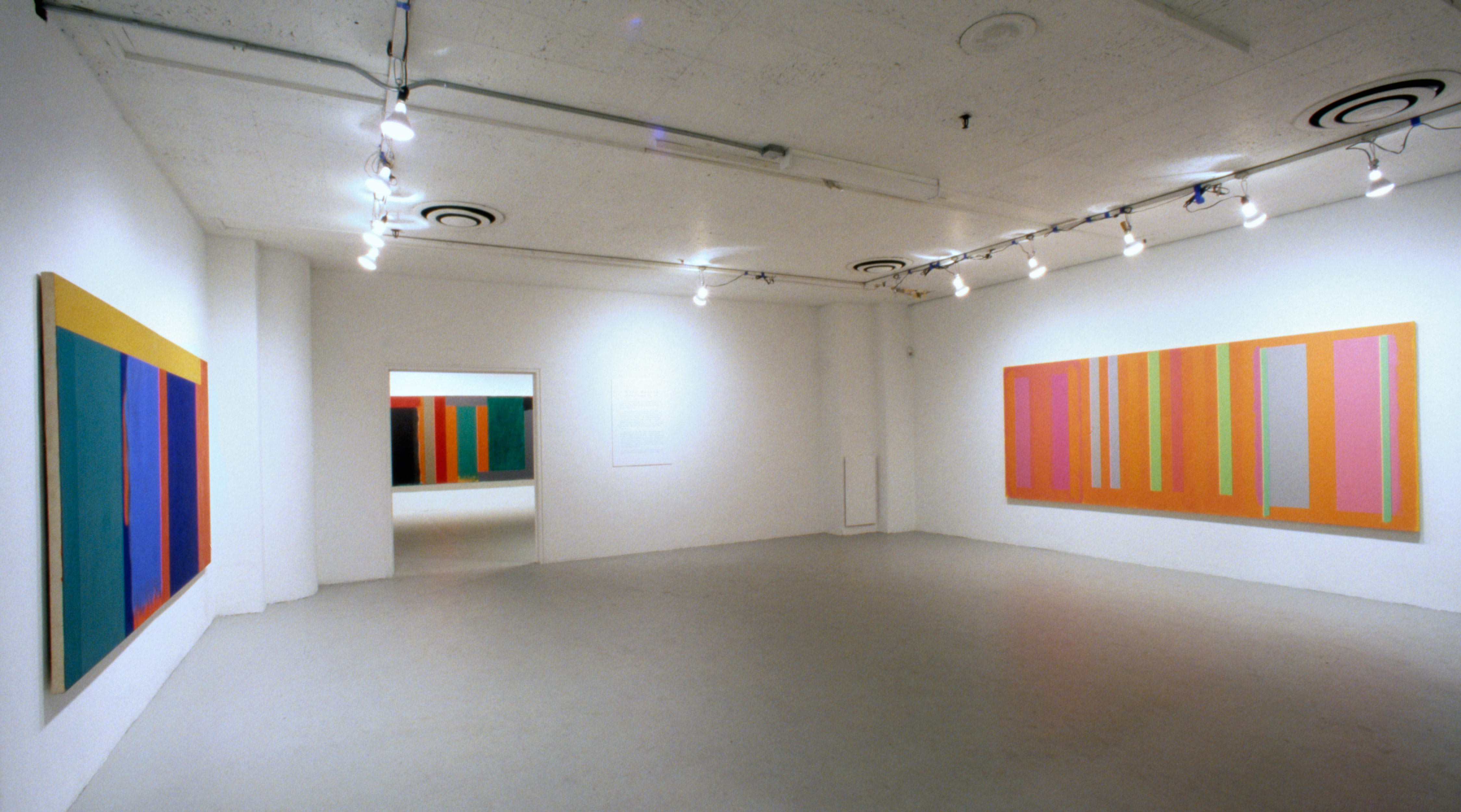
Bringing his chosen past into the present and reshaping it, Ohlson rouses our shared memory of the history of modernist painting. For example, the floating bars of color in Med (1990) recall late works by Hans Hofmann, a painter who belongs at once to European and to American modernism. Where Hofmann held his rectangles tight to the surface, as in Cubism, Ohson sets them adrift on a vast emptiness. In noticing this difference, I am reminded of the feeling of being in certain American places – not the ultimately unlocatable landscapes evoked by Newman or Clyfford Still, but somewhere more specific: the Midwestern plains. That is where Ohlson spent his early years – Iowa, where he was born, and Minnesota (he graduated from the University of Minnesota in Minneapolis in 1961). He moved to New York in the early ‘60s, where he has lived and exhibited ever since.
Even though I don’t want to give a narrowly referential reading to the work of an adamantly abstract painter, it seems worth noting that there is something very familiar to me – another Midwesterner – in the way the architecture of Ohlson’s color give a tenuous focus to the spatial immensities he opens up. I think of railroad stations, isolated barns, airplane hangars – not the buildings themselves, but their significance as signs of human purpose and perseverance in a space that can seem not only infinite but also indifferent. Thus the public history of art and the private history of my experience fuse, and a painting becomes a field of meaning: personal, cultural and historical. In the endlessly pleasurable complexity of that meaning lies the point of Ohlson’s art and of the tradition it so brilliantly sustains.
Author: Carter Ratcliff is a poet and art critic living in New York, His most recent book is Out of the Box: The reinvention of Art, 1965-1975 (Allworth). A selection of his essays, The Figure of the Artist, will be published next year by Cambridge University Press.